New House Interview
I promised in a previous blog that I would do a post interviewing my Dad about the design and build of their new home on Brown Dog Farm. Mom and Dad were integral to the purchasing of this farm as their ‘Third Act’. They loved the rural life and their beloved Camp Catlett was a wonderful old farmhouse and beautiful property. It was however, getting to be a lot of work. This move provided them with the chance to maintain that lifestyle with built in ‘riff-raff’ neighbors who could share the upkeep of garden, and rural lifestyle. And the ‘riff-raff’ neighbors benefited from the additional company and help of an older and wiser, pair of Farm partners. We are learning the ins and outs of multi-generational farming, the ups and downs, of living next door to each other and I can honestly say the scales still tip to the benefits more than the detriments... so here it is:
R:What was the inspiration for the design of this house?
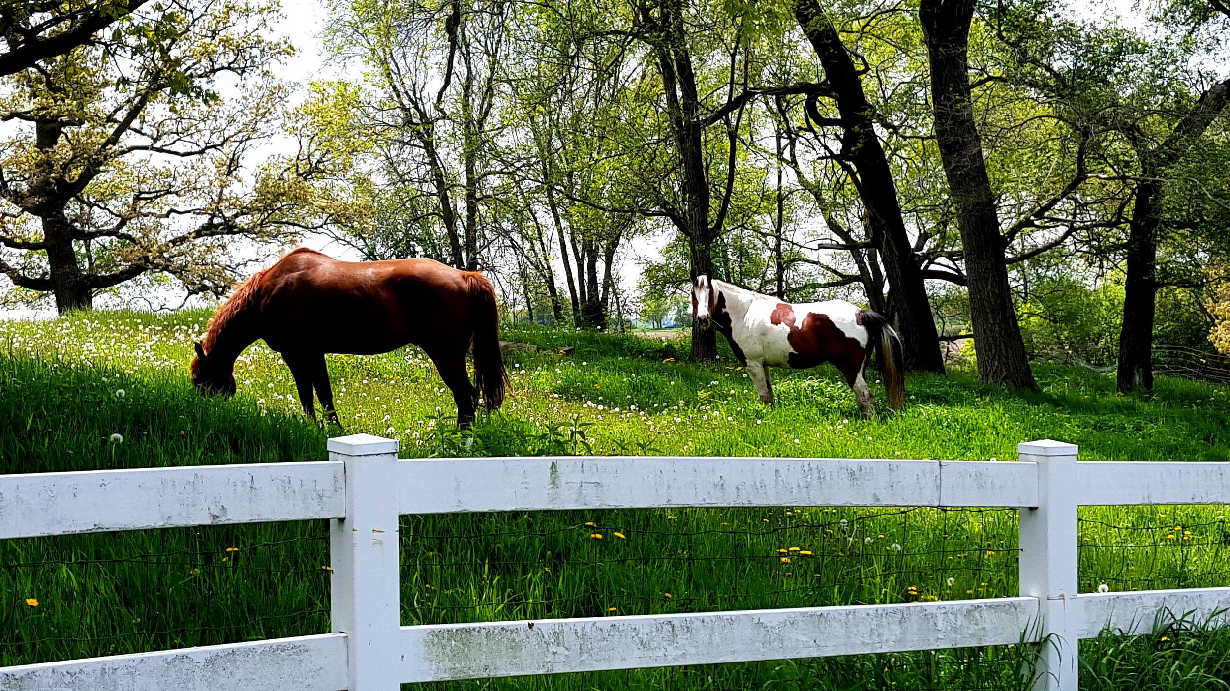
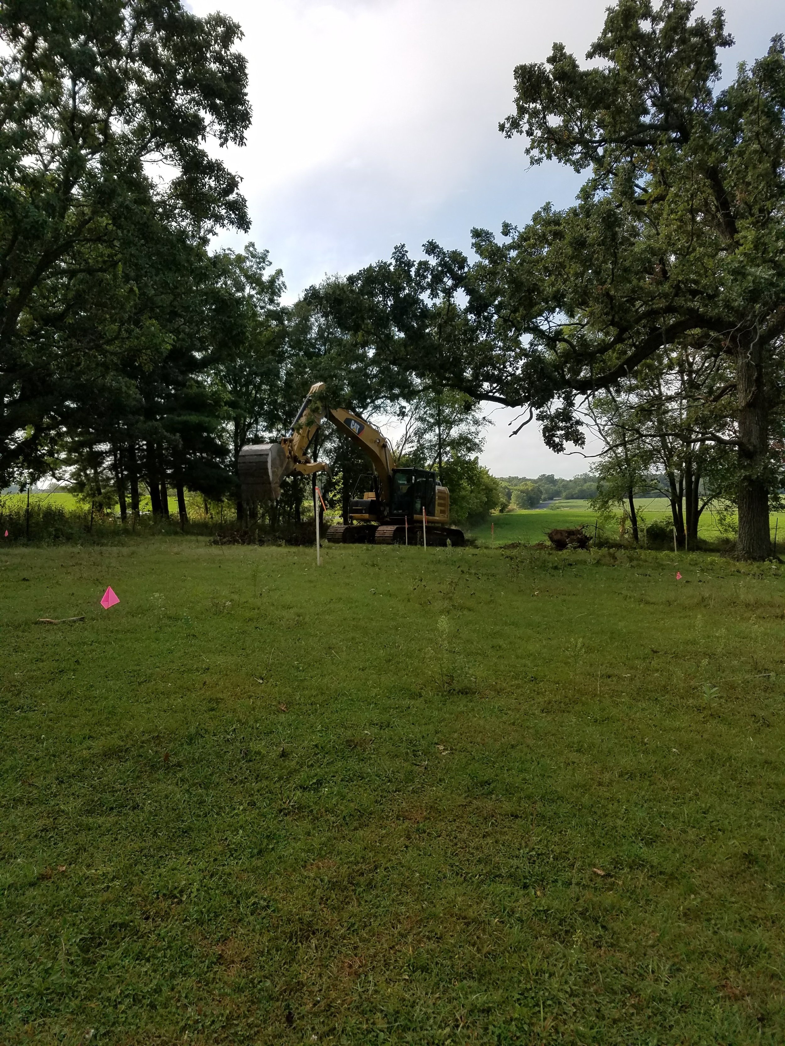
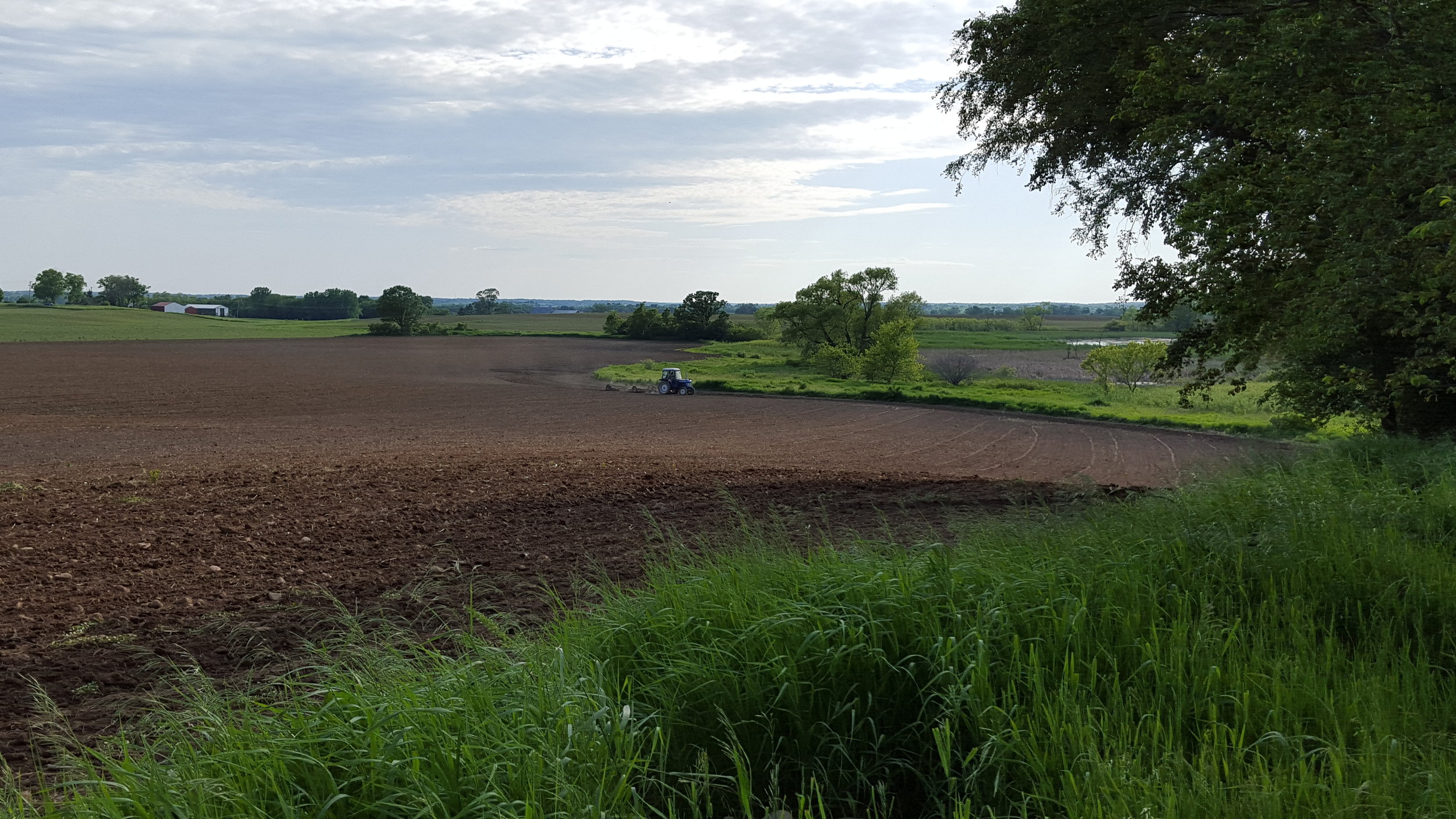
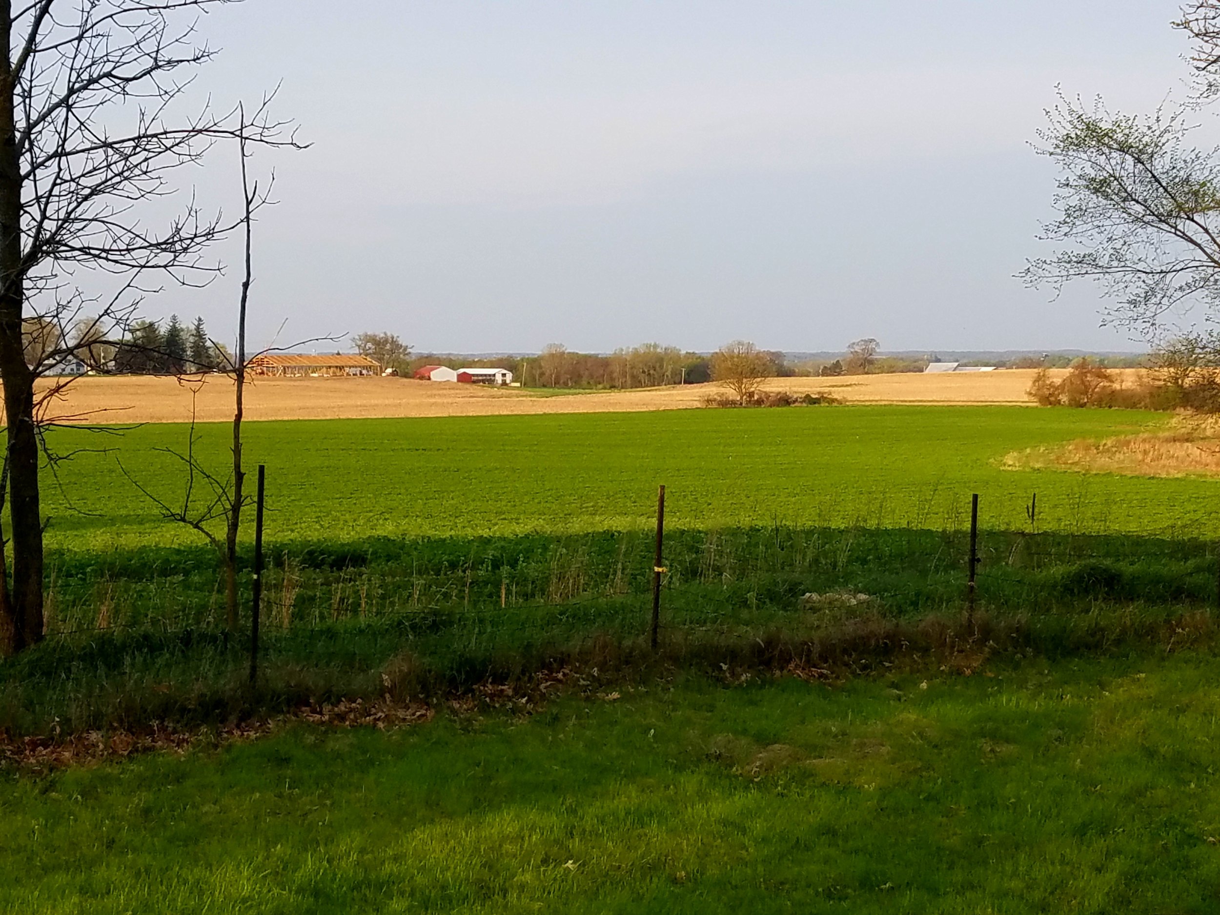
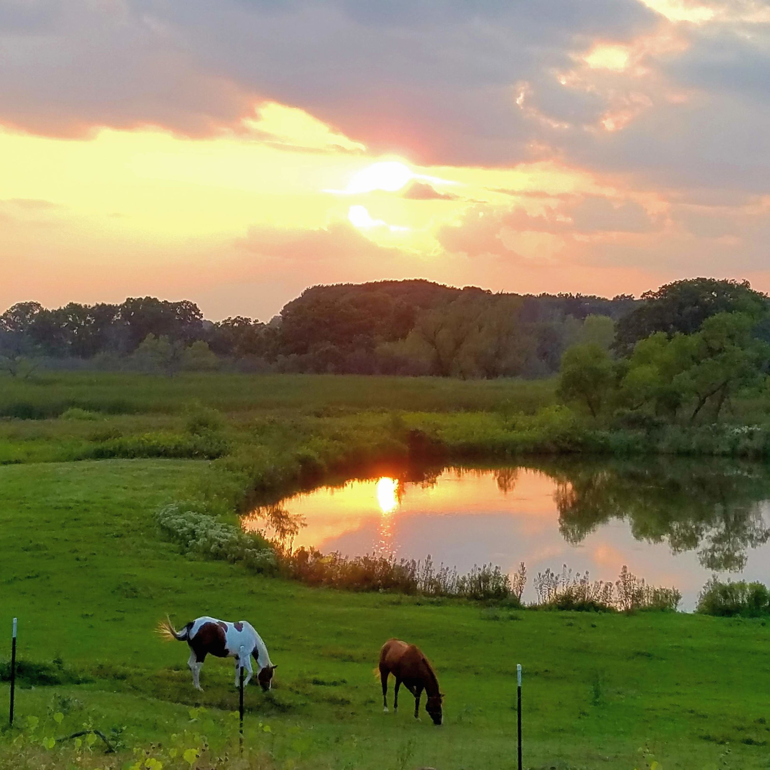
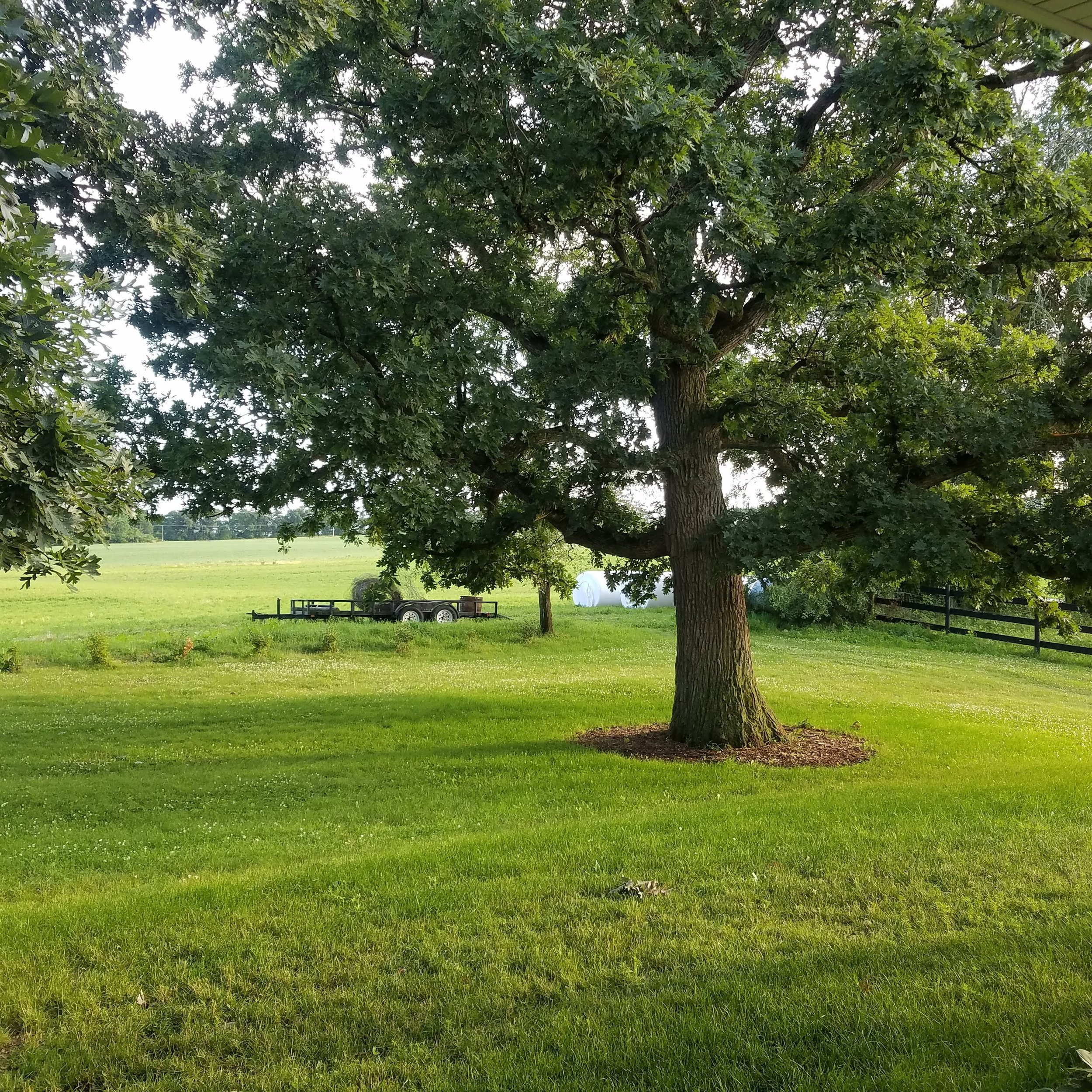
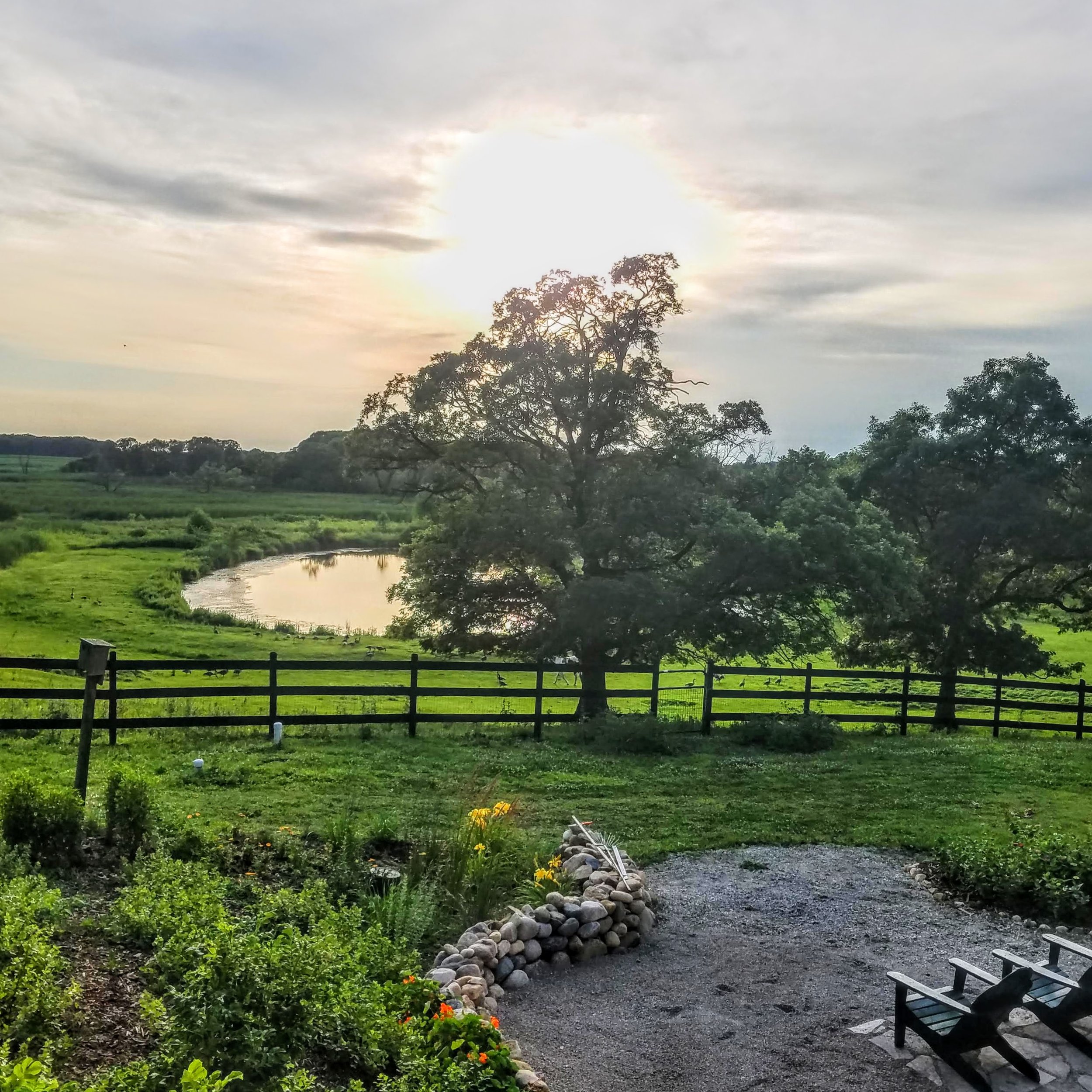
B:The inspiration for the design of this house were based on my interest and study of The Pattern Language, a book by of Christopher Alexander, Sara Ishikawa and Murray Silverstein of the Center for Environmental Structure of Berkeley, California. The Pattern Language sets out a series of patterns, timeless entities about the structure of the relationships between humans and their dwelling spaces, that when all gathered (253 of them), form a pattern language that is useful to the design and building of homes, work-spaces or even entire neighborhoods or towns. The first basic concept of the pattern language is that the home should be predominantly livable; designed for both community spaces and private spaces. The primary inspiration for the home was its environment. We wanted to maximize the views to the south where the 3 gracious oaks give way to the rolling pastures, and to the west where the hill slides down to the pond and the wetlands beyond and the beautiful sunsets. Alexander says before you build anything, stake it out and see how it lives in the space. In this case we sited the house on the highest point of the property, a knoll between an array of the three oak trees and a small grove of elms on the NW corner.
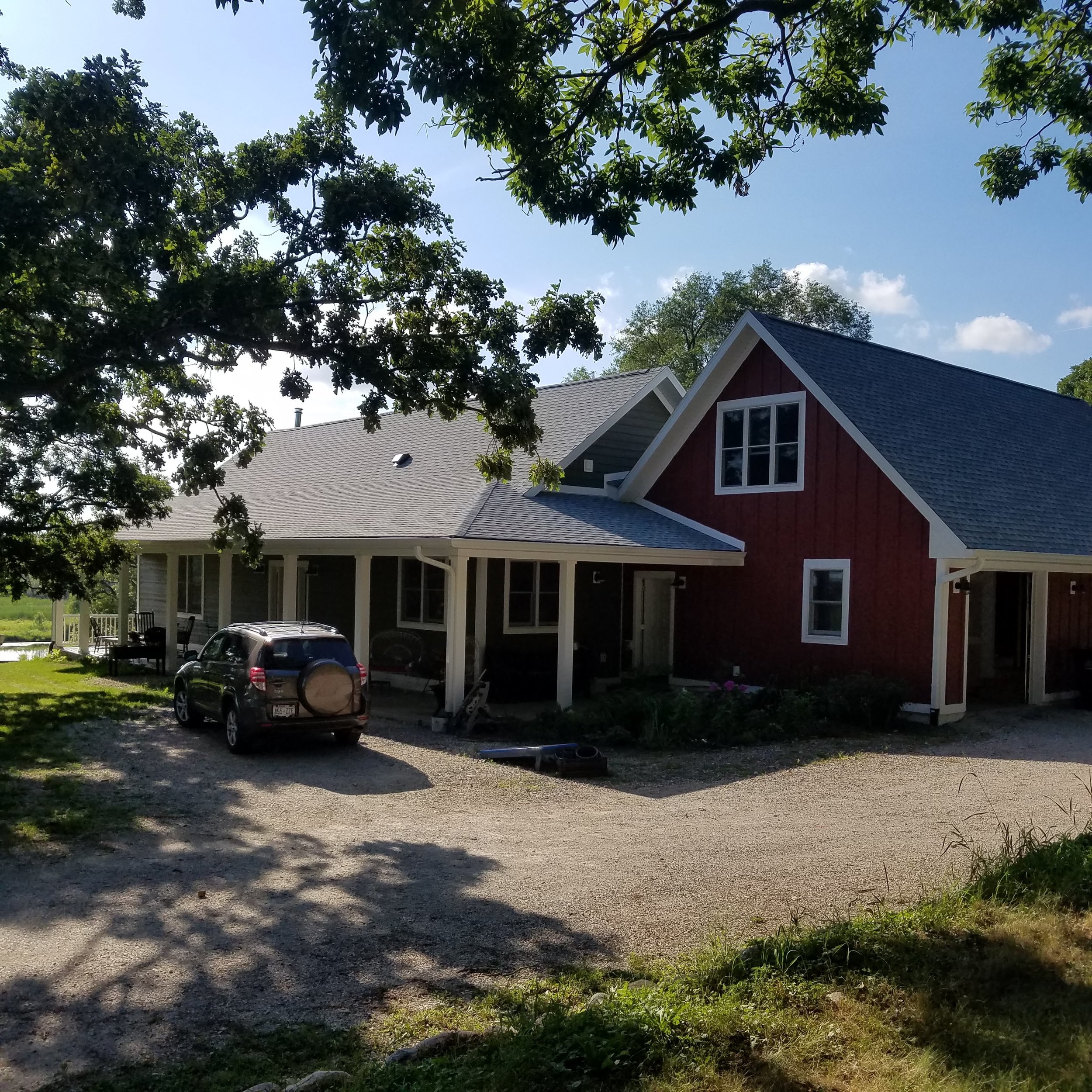
One pattern that we used to site the house was ‘wings of light’: i.e. wings that are no more than 24- 25 ft. wide that ensure that the inhabitants are no further than 12 ft. from access to natural light. The wings we utilized were in the shape of a backwards el. With the longest wing about 75-80 feet running east to west and another wing running north south about half that length. The long wing primarily faces the oaks trees, and the hay fields to the south. The north/south wing looks out to the west and the pond and wetlands beyond.
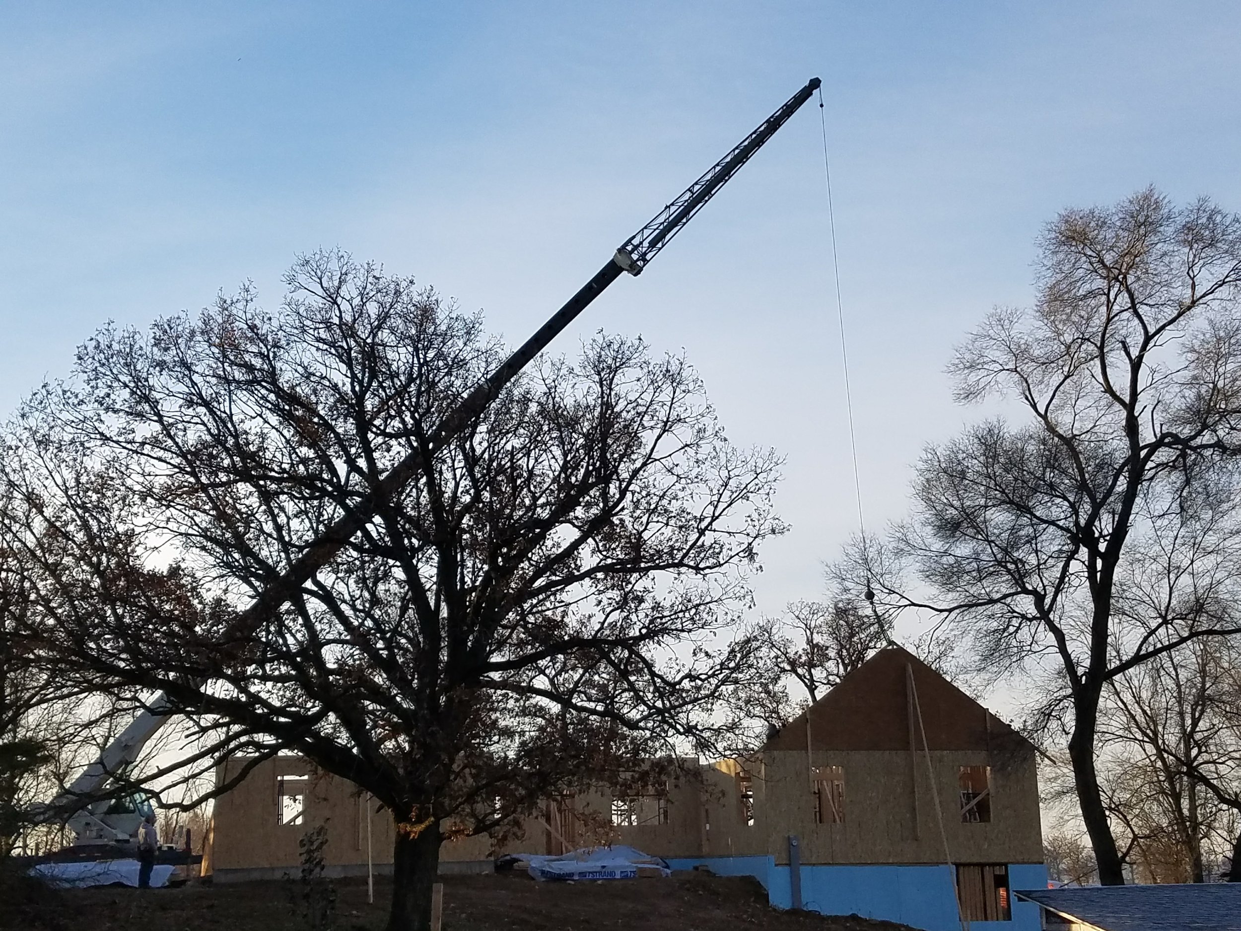
The problem that we saw when we sited the house, because it was perched up on the highest point of the land, was that it was exposed to the prevailing SW wind. It took a while of working with the architect who did the drawing to site the house down into the side of the hill in such a way as to have vistas of the south and west and not have to have too many steps and stairs to get into the house. Finally, the house fit down into the site with a lower level walkout.
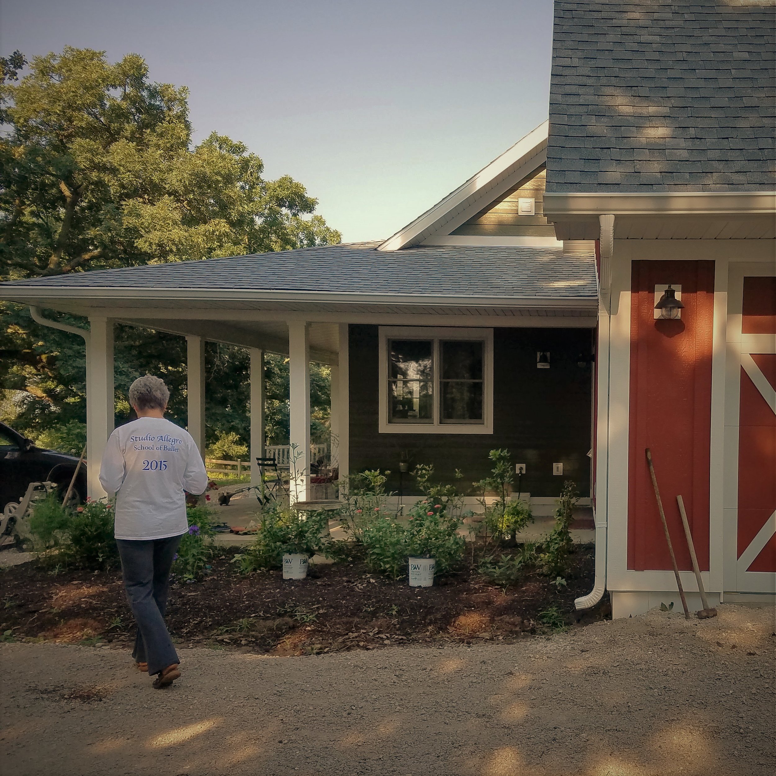
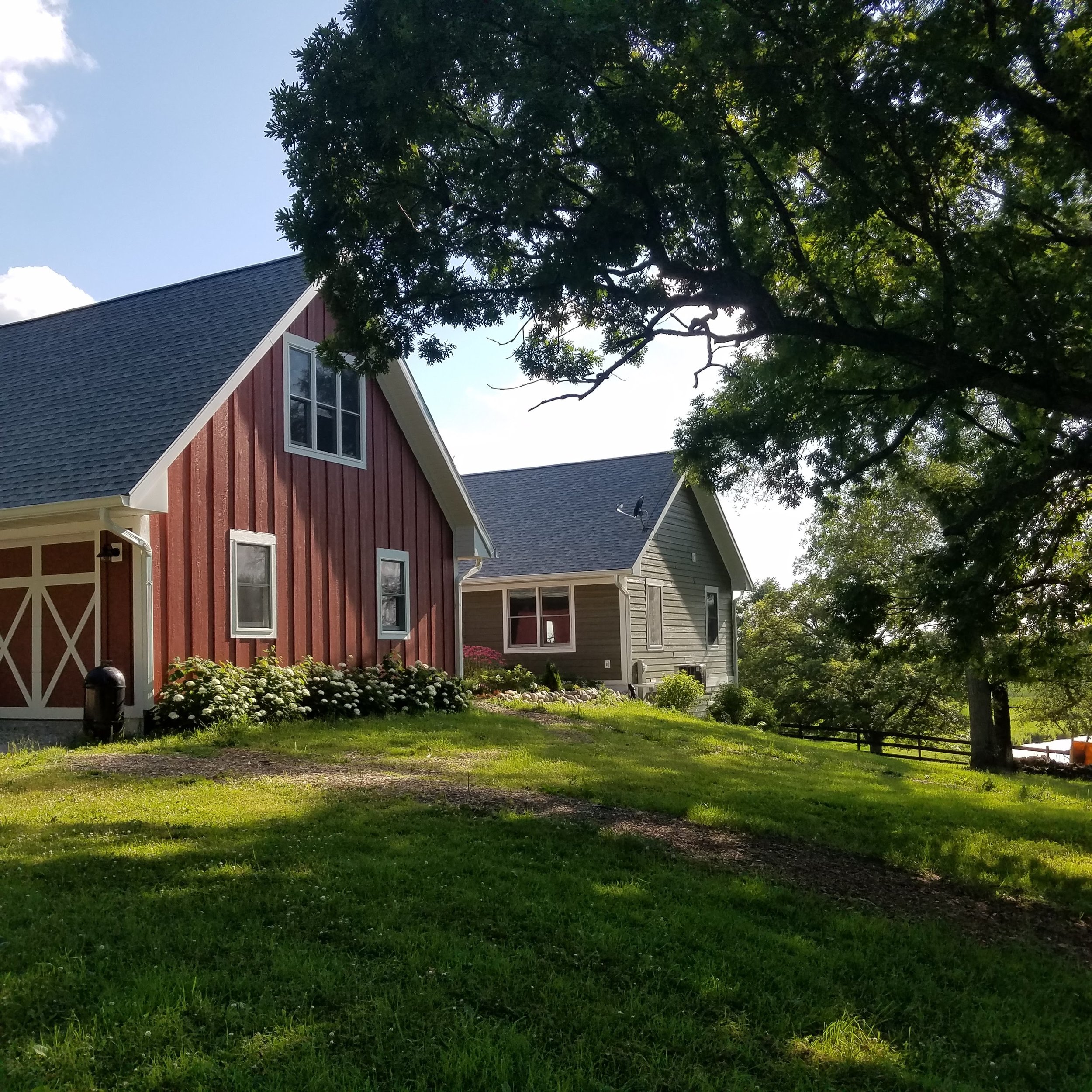
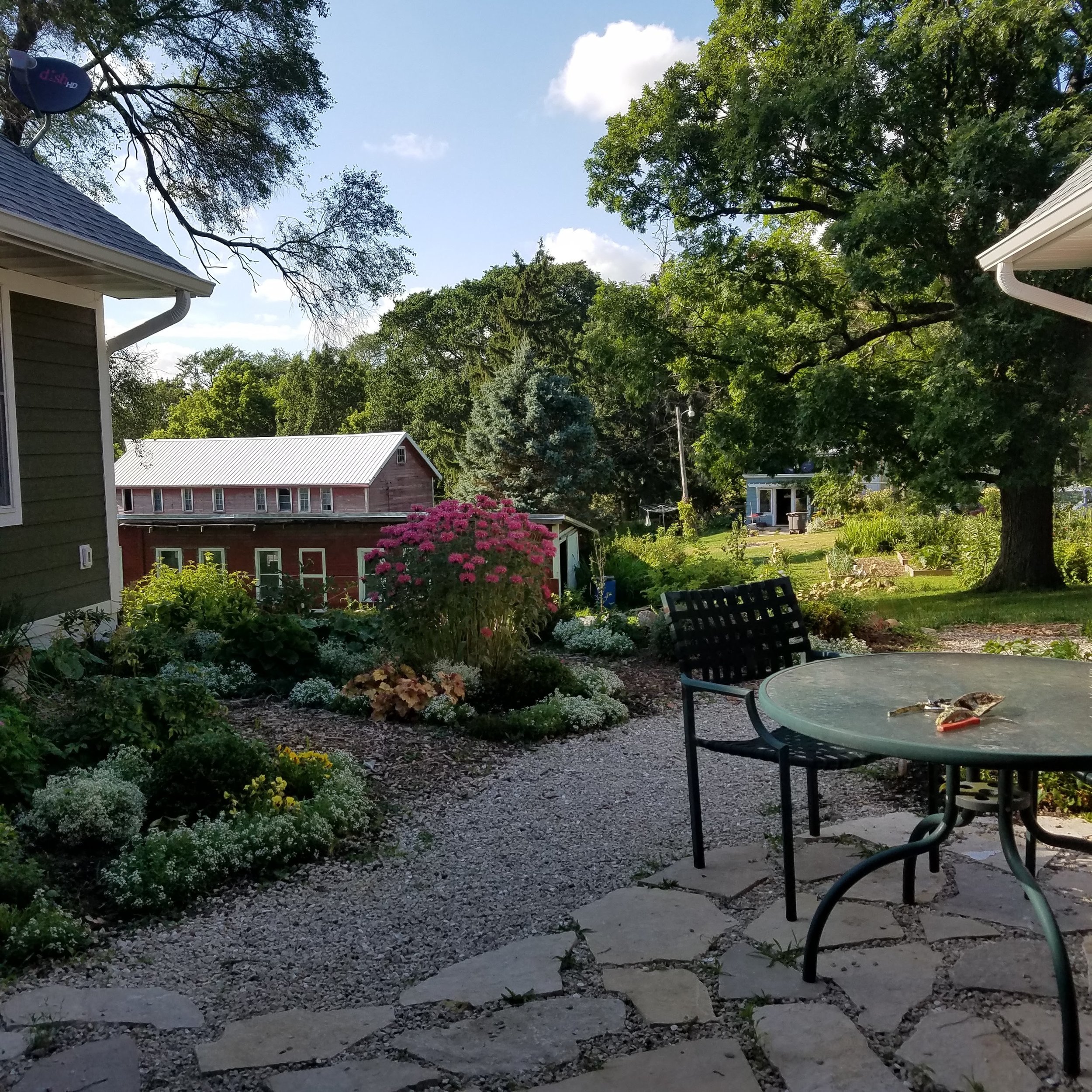
We wanted to have a barn/garage that would allow for covered direct access into the living space. So another north south wing was added. This created an interesting outside room in the form of a courtyard, where we could have a patio and an herb garden protected from the NW and SW prevailing winds.
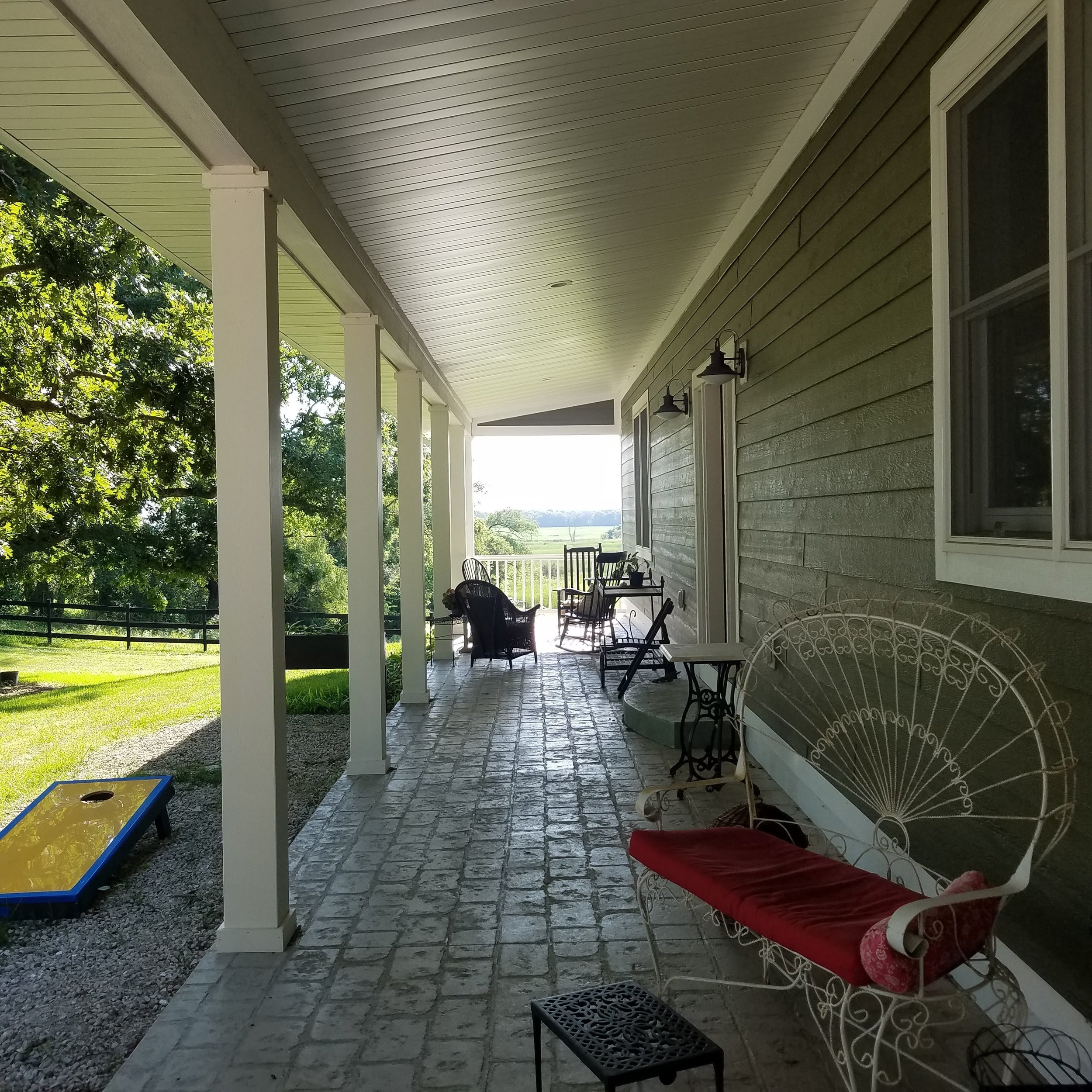
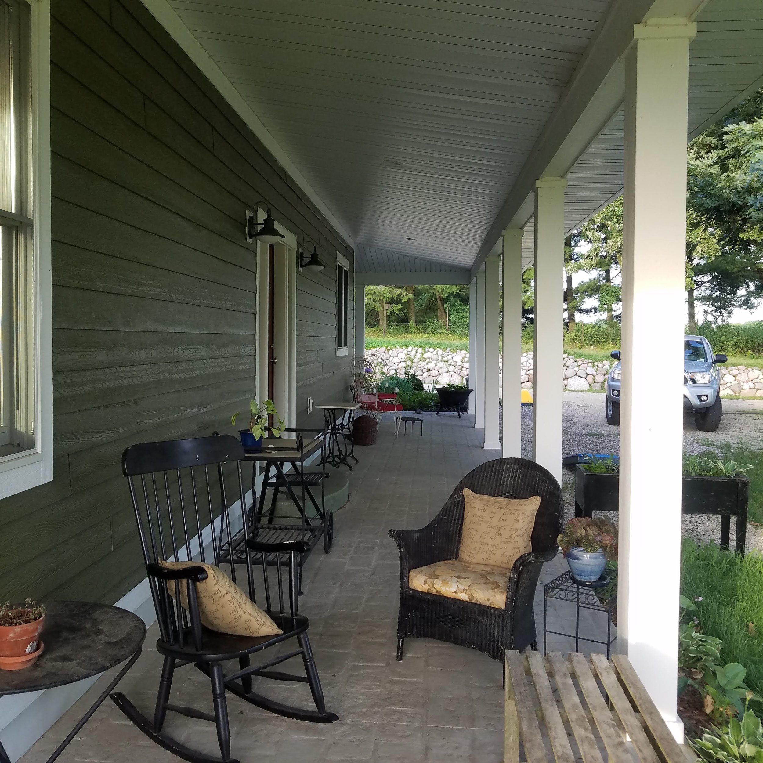
Another inspiration was the farmhouse vernacular to our rural Wisconsin site. One of the patterns utilized was a ‘cascading roof lines’. The Barn/Garage has the highest roof, because it has a loft space with 10 ceilings. This is followed by the main wing and then another lower roof line flows over the long shed roof of the porch which extends the whole length of the main wing and gives a beautiful view to the south. The bedroom wing is lower than the main wing. The roof lines cascade down the hill following the topography of the land. It gives exterior interest to a pretty simple ranch house design.
Inside the layout was again inspired by The Pattern Language concepts of ‘community space and private space’, and ‘varied ceiling heights’, ‘wings of light’, and ‘flow through the rooms’, ‘windows overlooking life’, ‘common areas at the heart’, ‘half private office’, and ‘a room of one’s own’ among others.
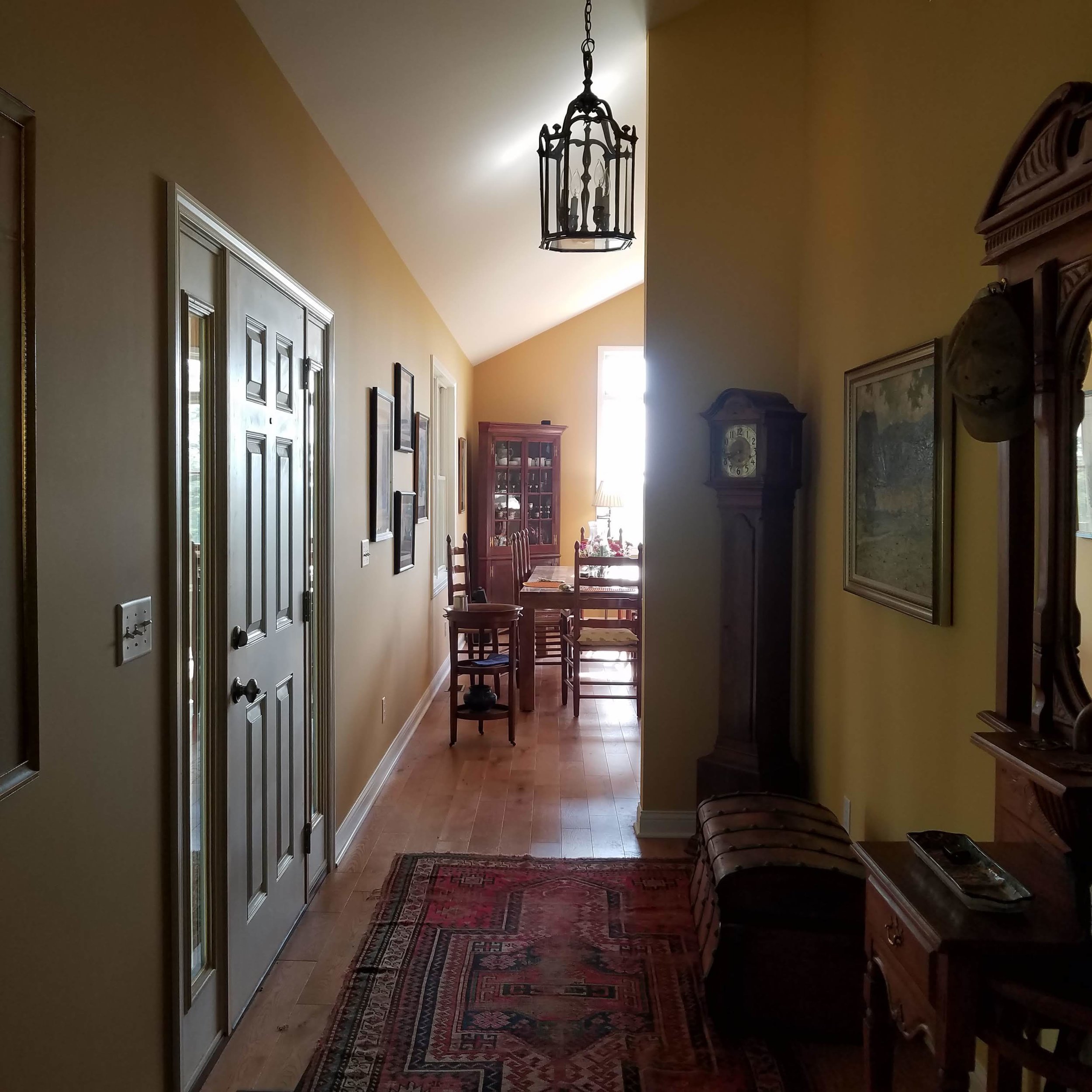
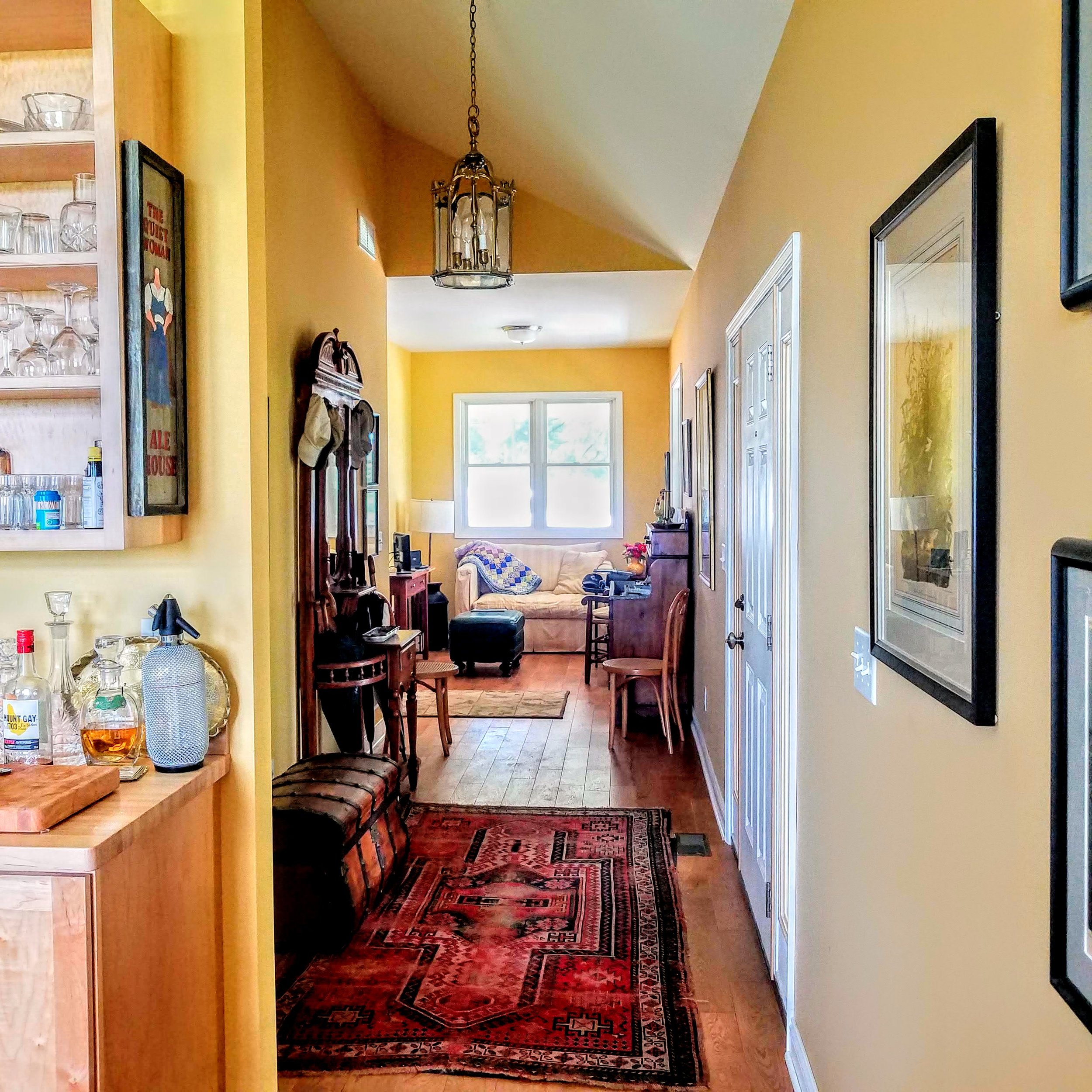
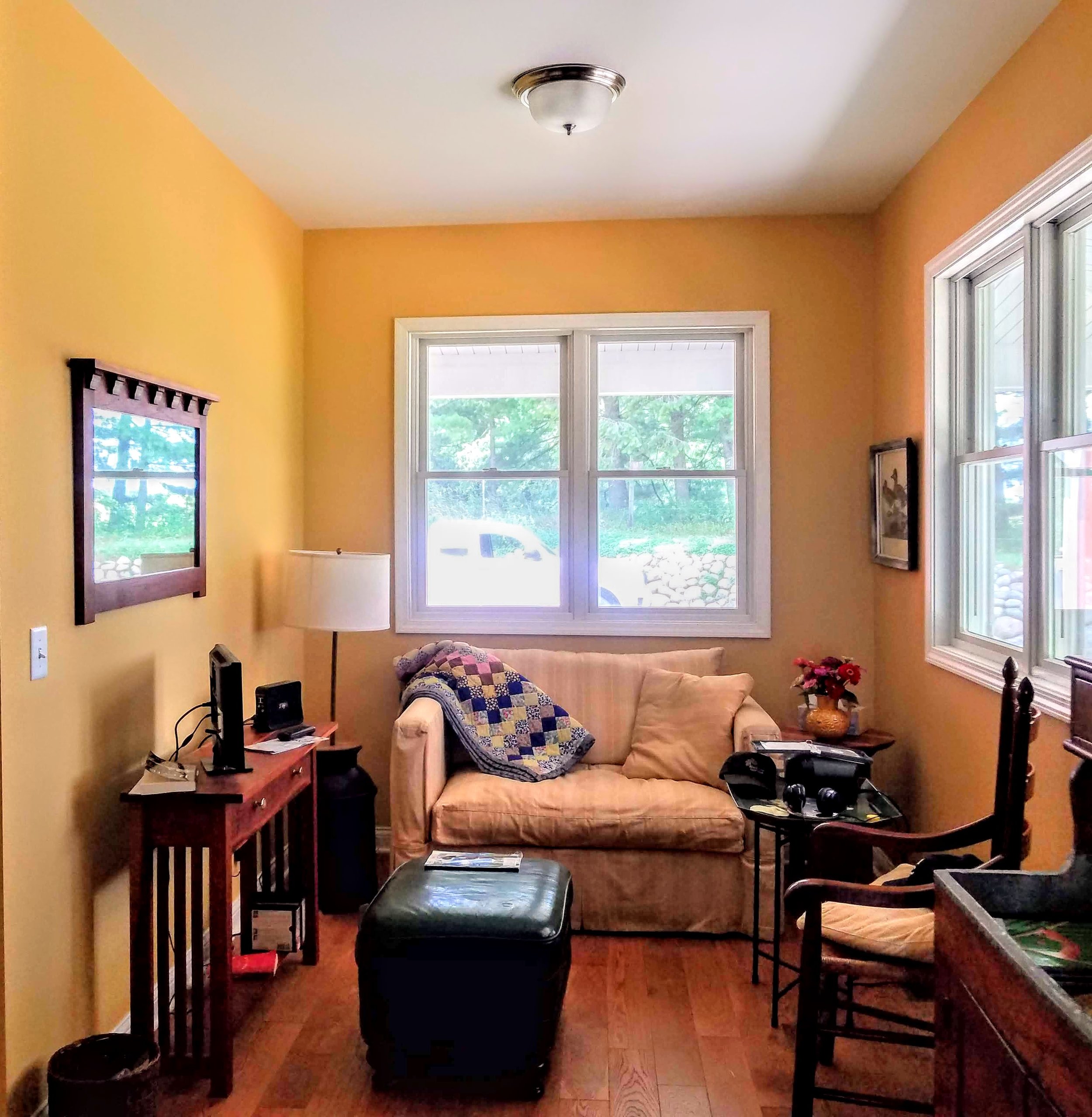
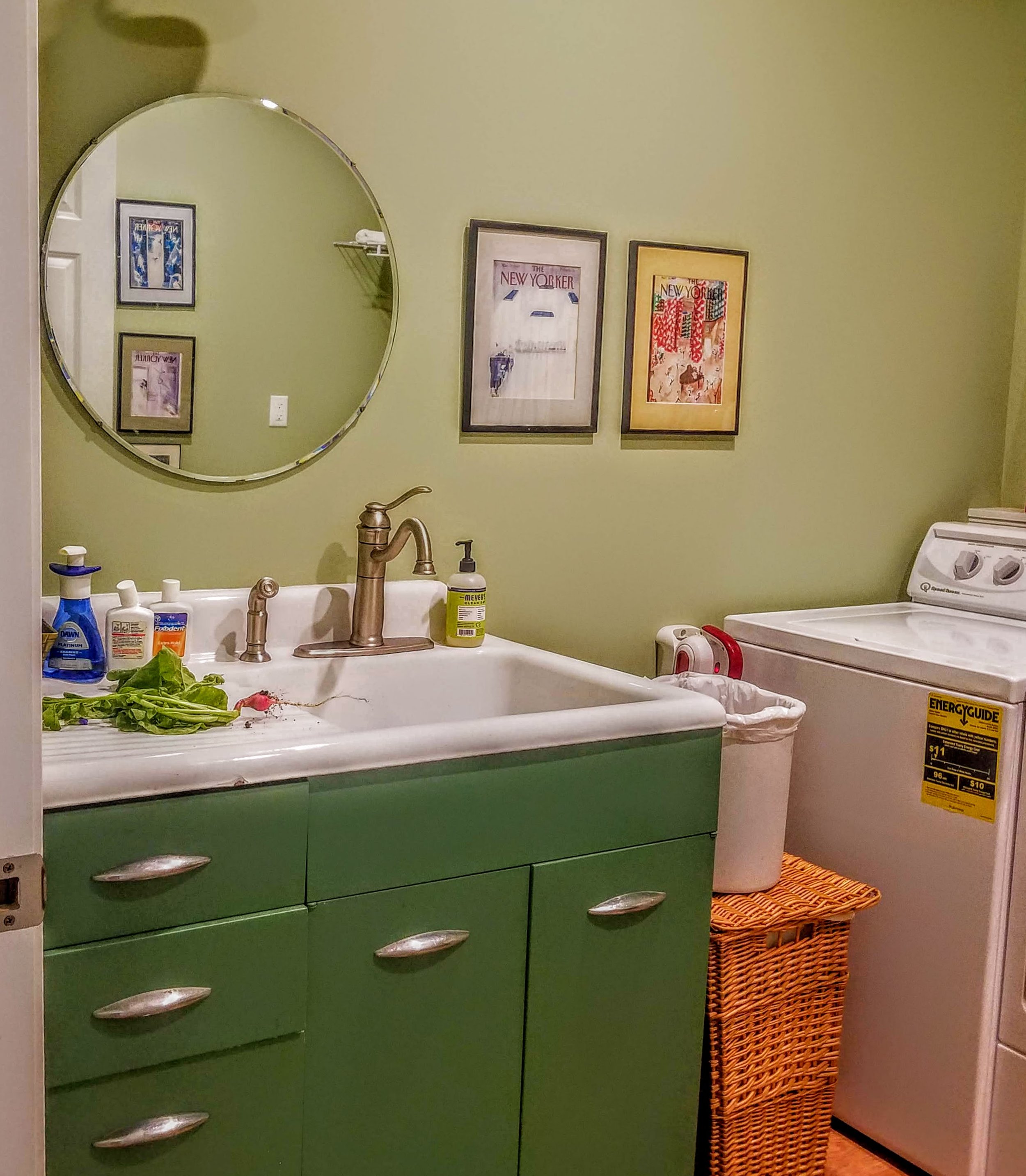
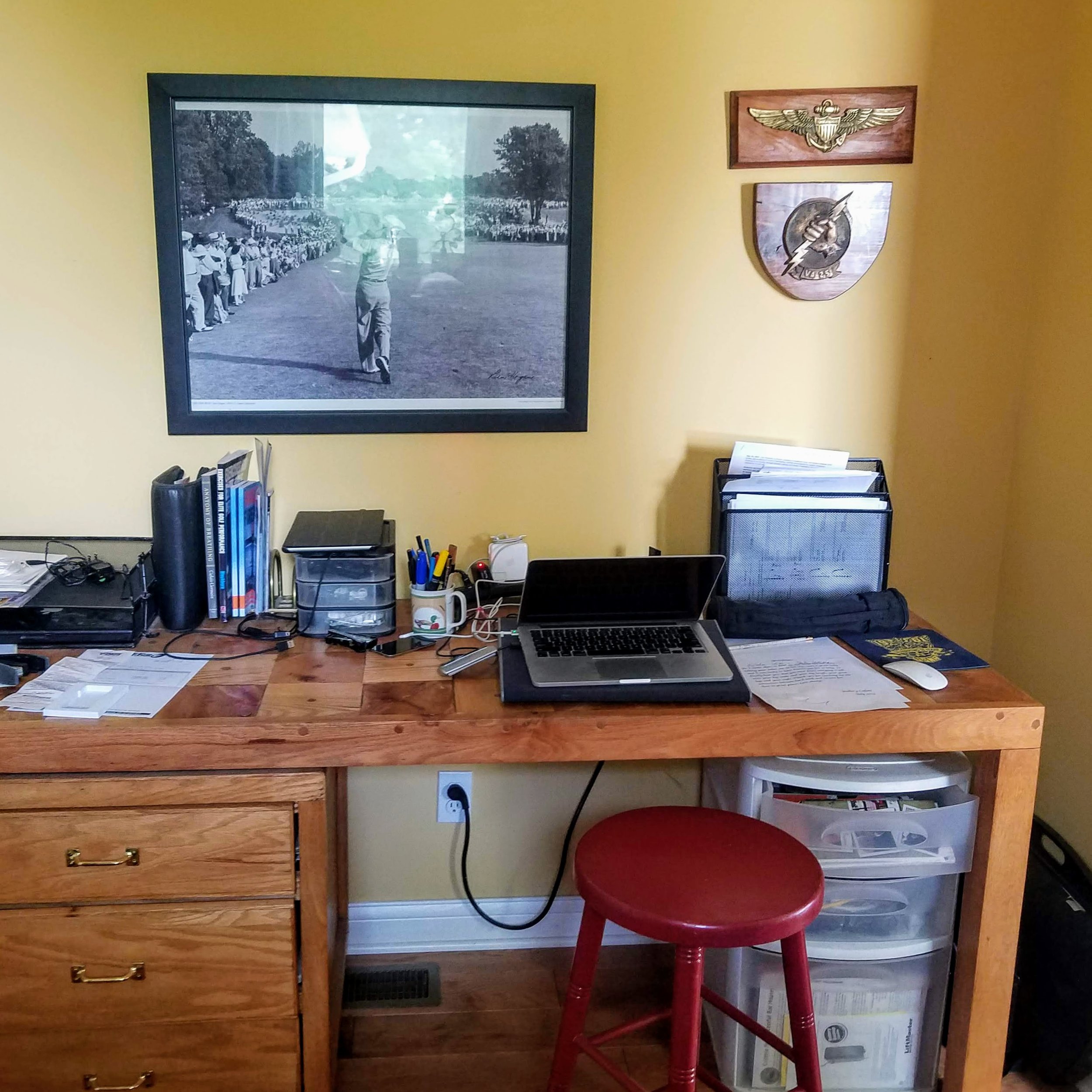
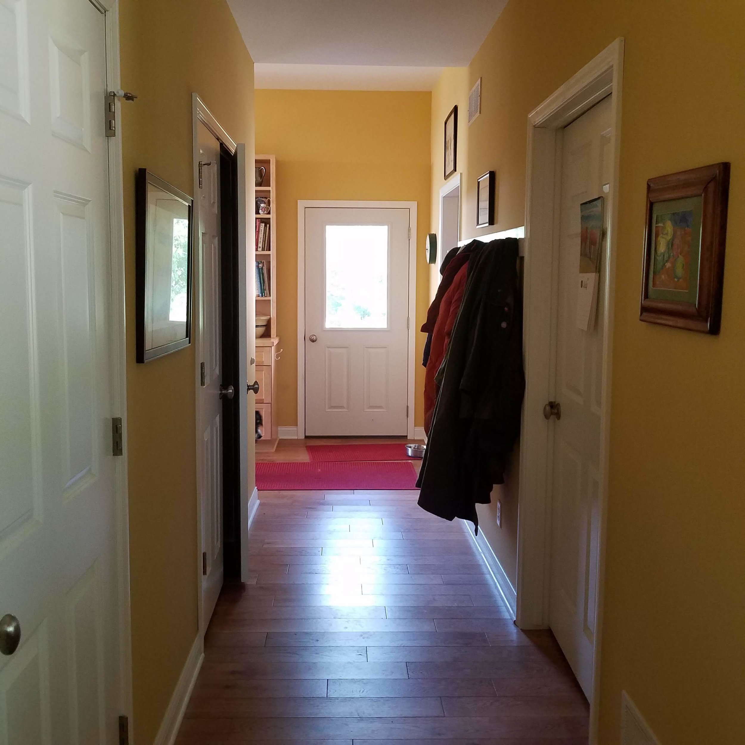
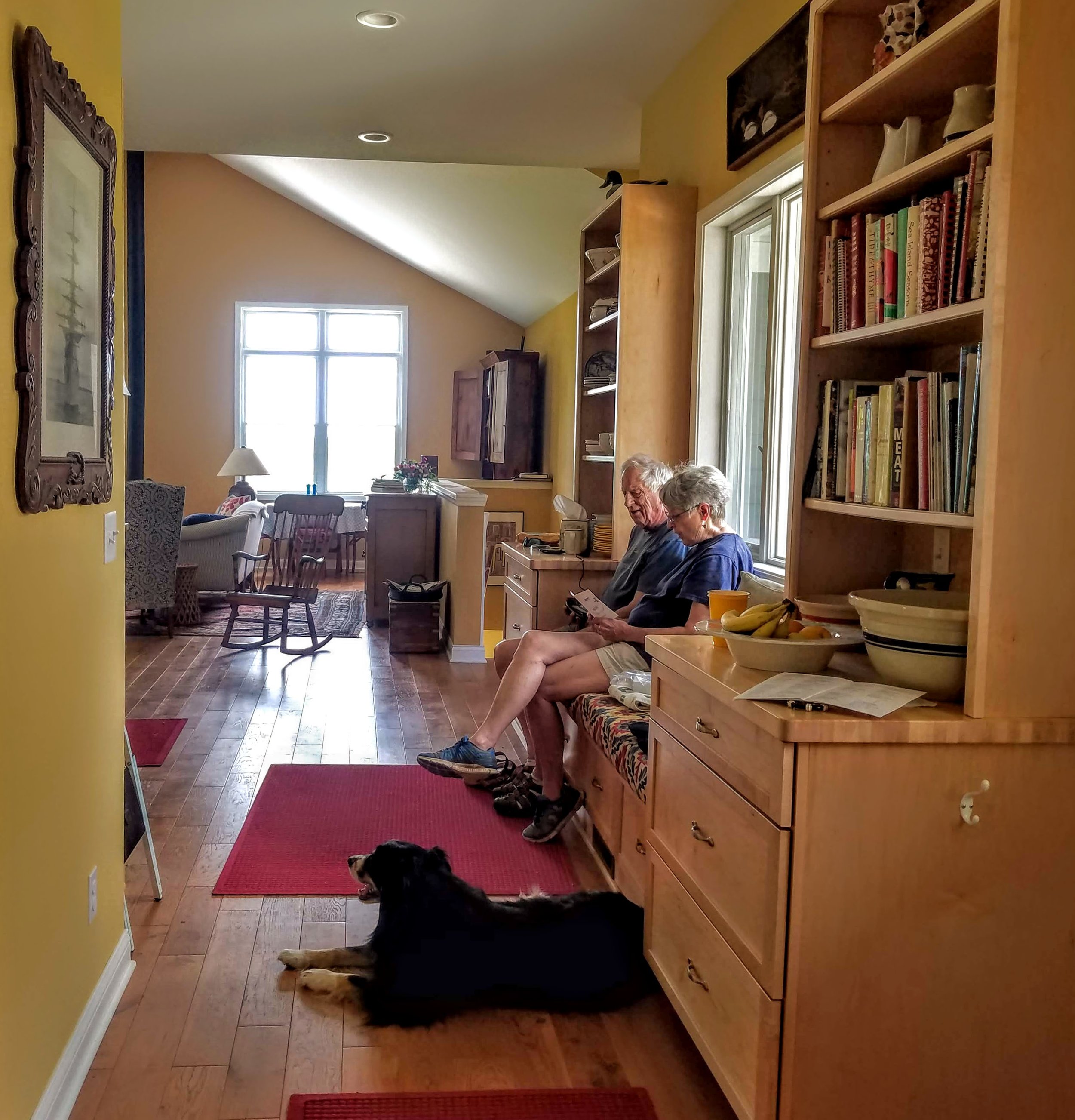
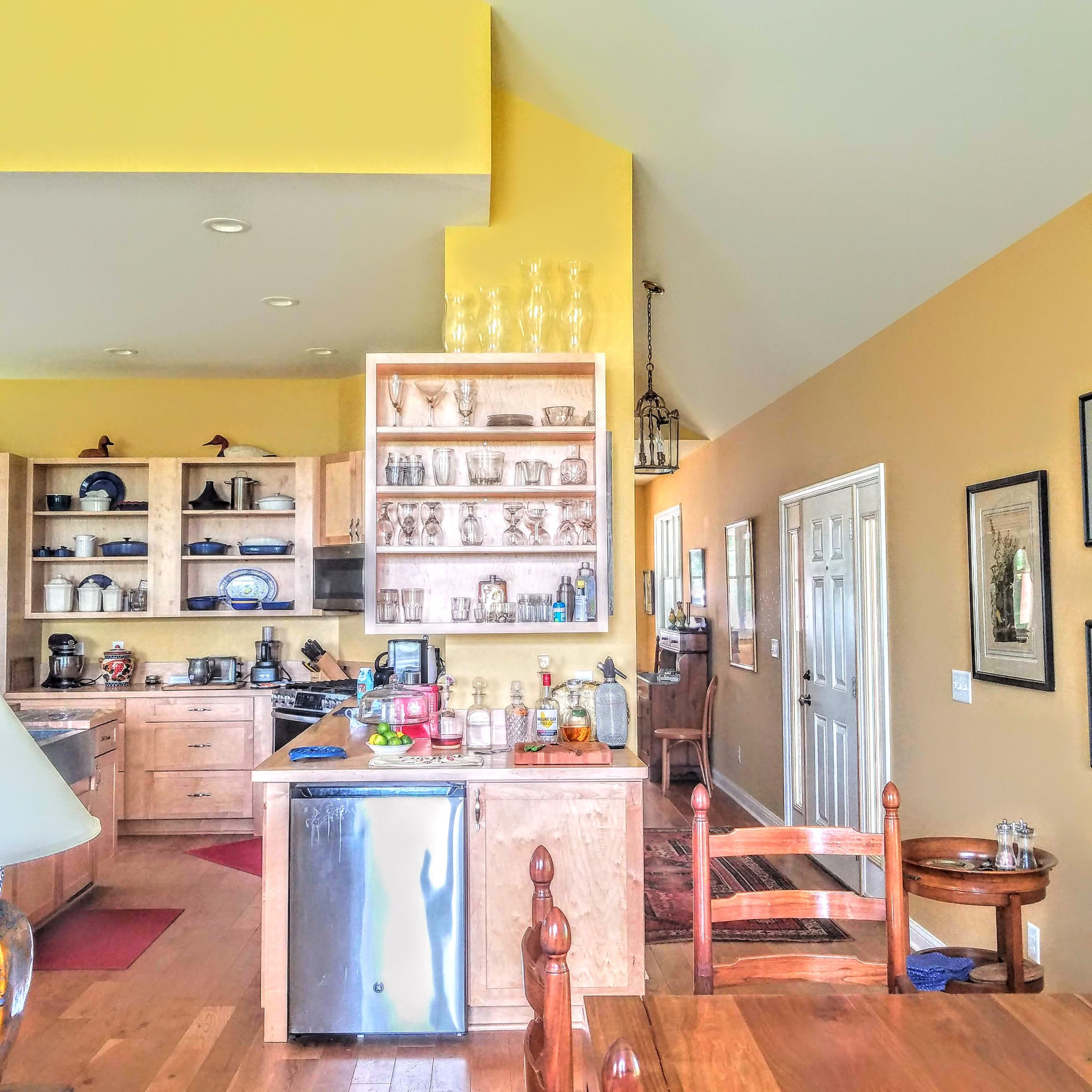
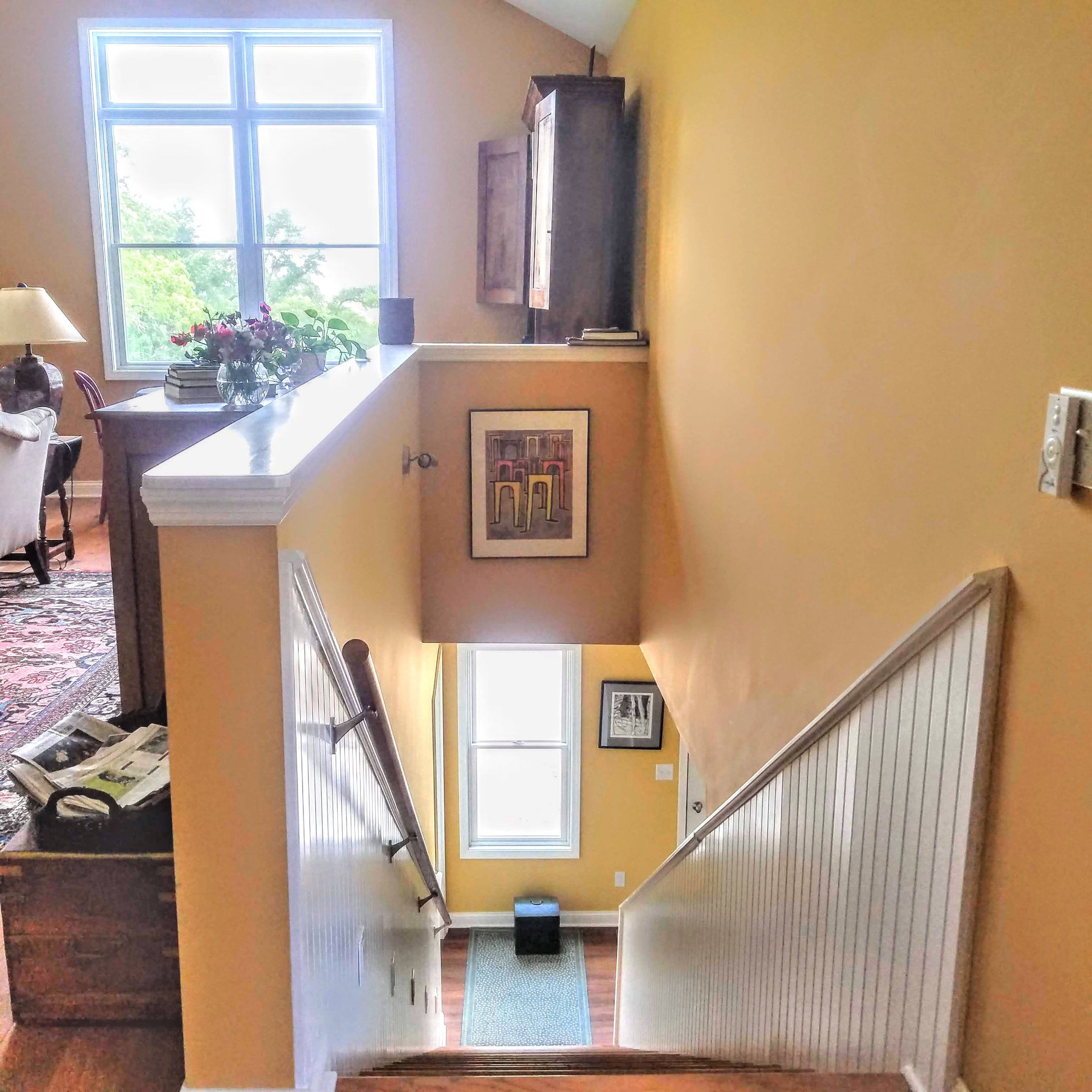
Flow was a major factor when designing the house. When you enter the house, a front hall leads you to the left and into the great room, or to the right and into the east room, an away space for quiet reading and then down a short corridor that loops back into the common space. It’s a big loop with wide hallways, that dogs, cats and kids can all run around in with no restrictions. In that corridor, there is a pantry and a laundry/bathroom. At the end of the corridor, on the right, the way into the garage is an office/mudroom. It was designed for ease of emptying the car right from the garage, into the mudroom and straight into the kitchen in about 30 steps. That’s very, very convenient. That was a major consideration for the old folks to be able to walk in a covered space, out of the snow, into the house. So, accessibility was the driving force for positioning the barn at the top of the el which created a U-shaped building and put the courtyard in the middle. At the end of the corridor there is a door into the courtyard.
The courtyard holds a grill patio with room for a table and chairs and a garden of perennials and herbs. That is very close to the kitchen and makes Granny’s trip for fresh herbs when cooking very short. The courtyard is open to the north and looks down the hill to a beautiful oak tree and the big vegetable garden to the north. The courtyard is now protected from the SW winds.
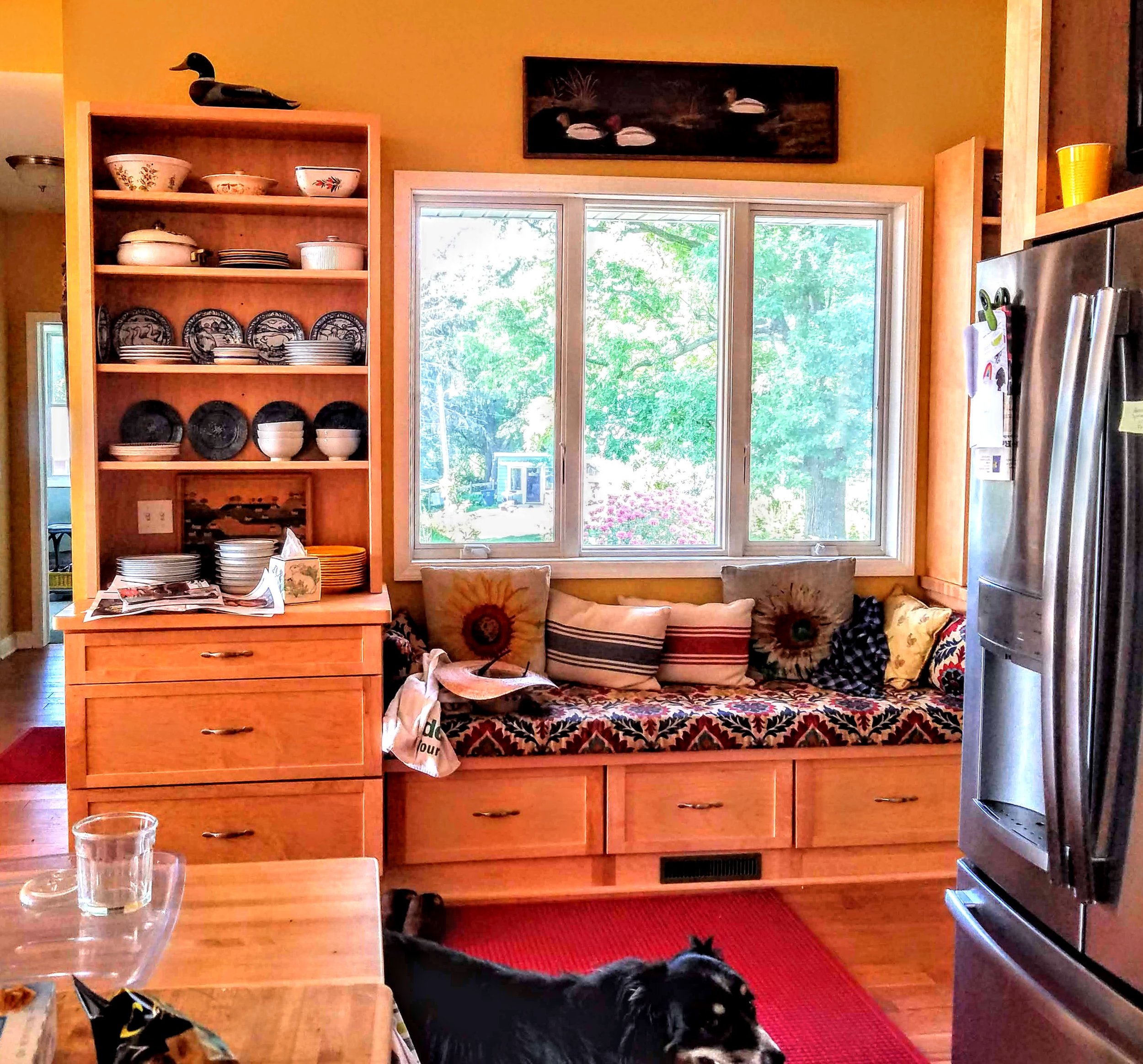
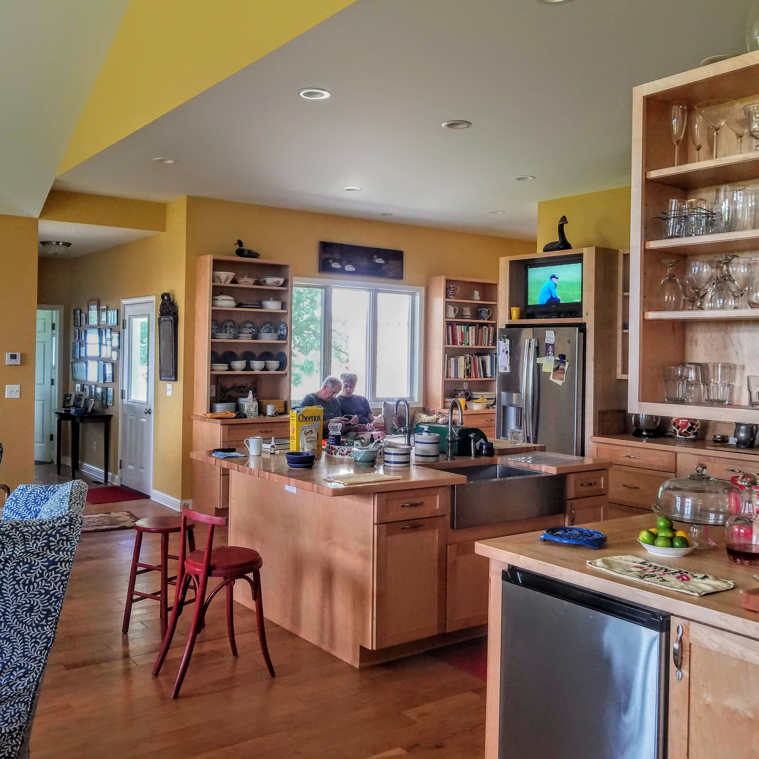
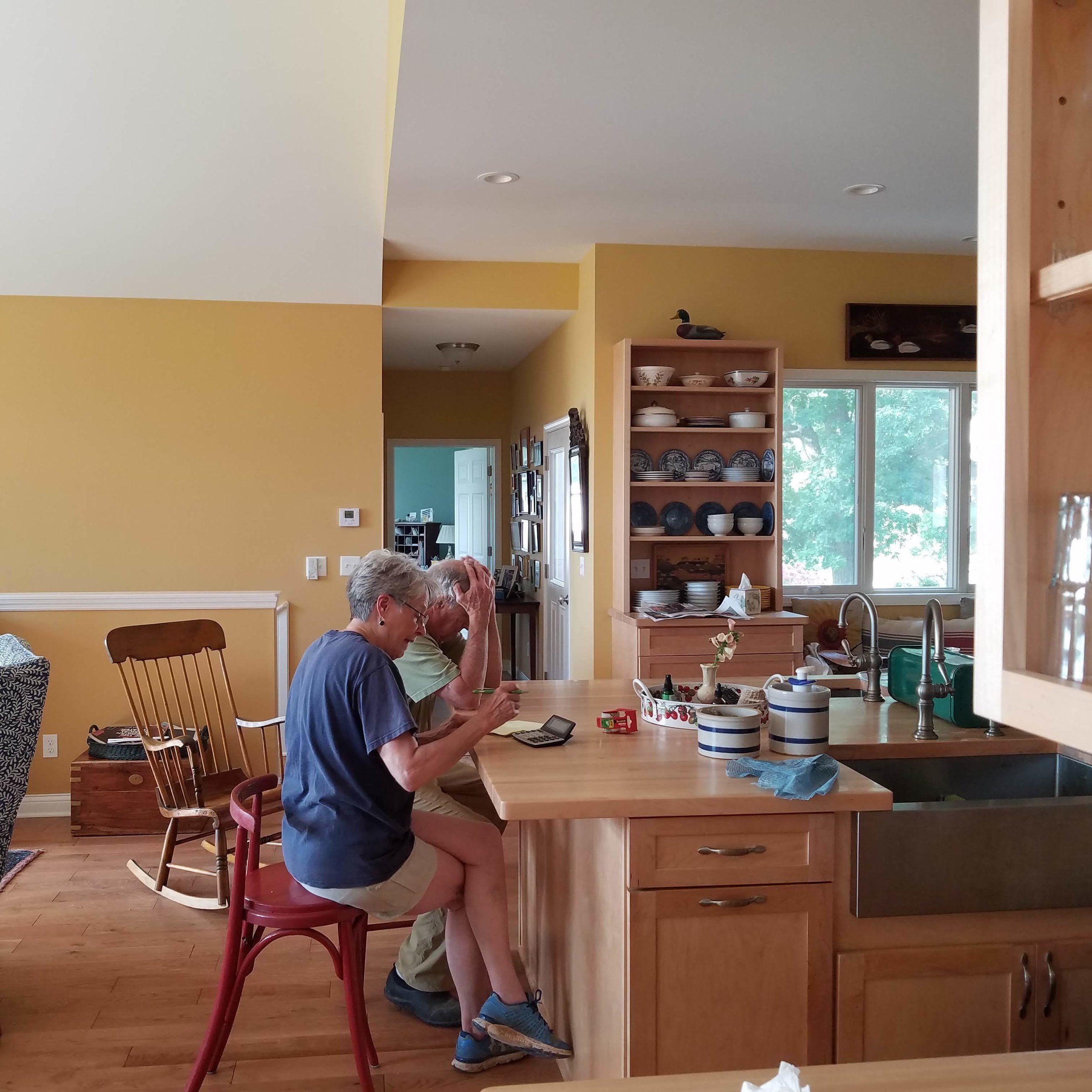
At that juncture you can turn left into the kitchen area which has a long window seat that looks out into the courtyard and allows conversation with the cook. It allows all the kibitzers to tell the cook what to do without crowding her space. The kitchen has good flow also, you can have 5 people in the kitchen all able to work together. There are 2 sinks, one for prep and one for dishes. There are 2 Refrigerators, one main one and another for beverages near the bar. There is a large island holding the sinks and a large countertop area for seating. The kitchen is at the heart of the house, which is where all the action is.
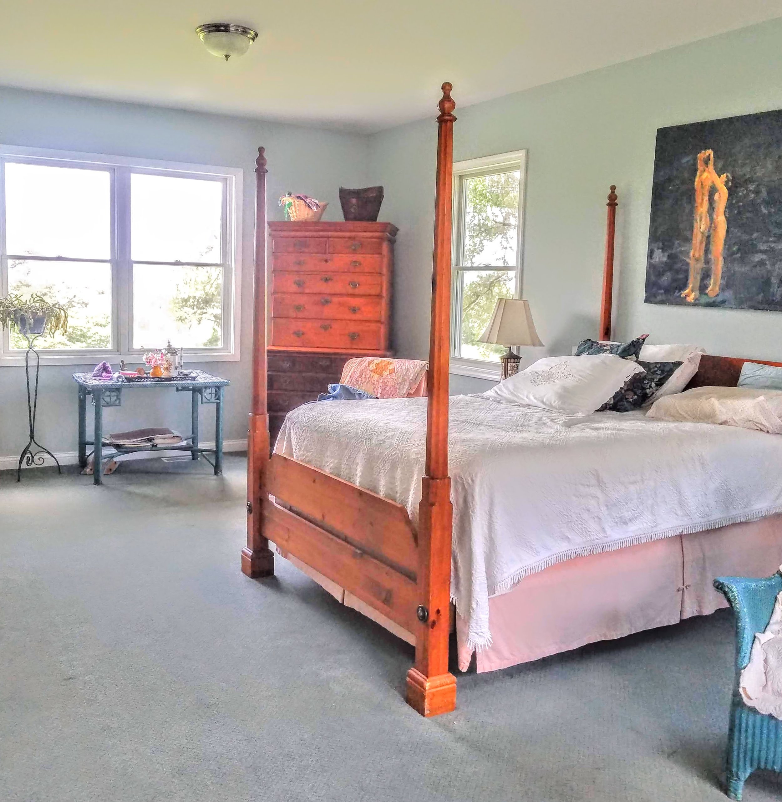
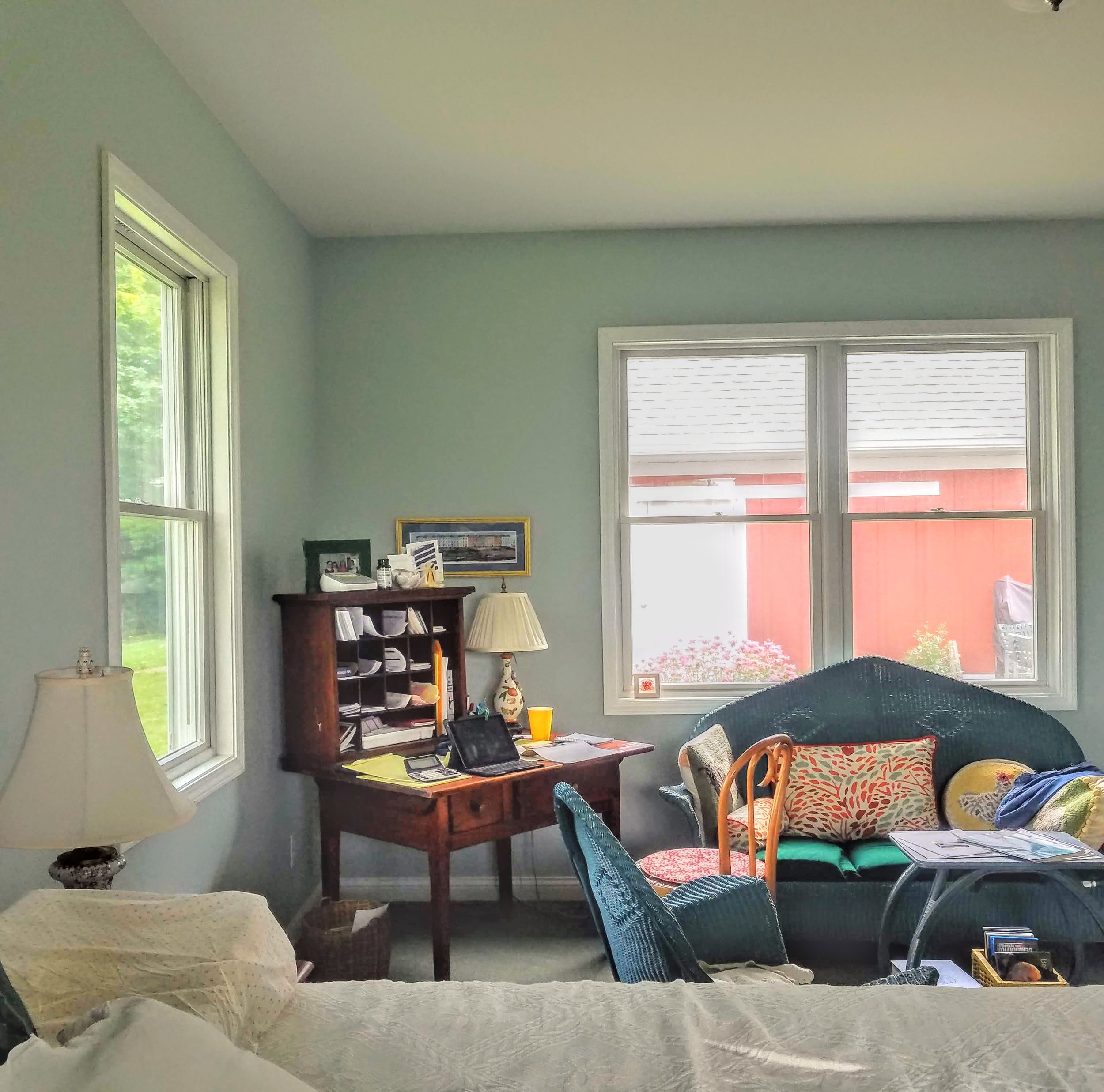
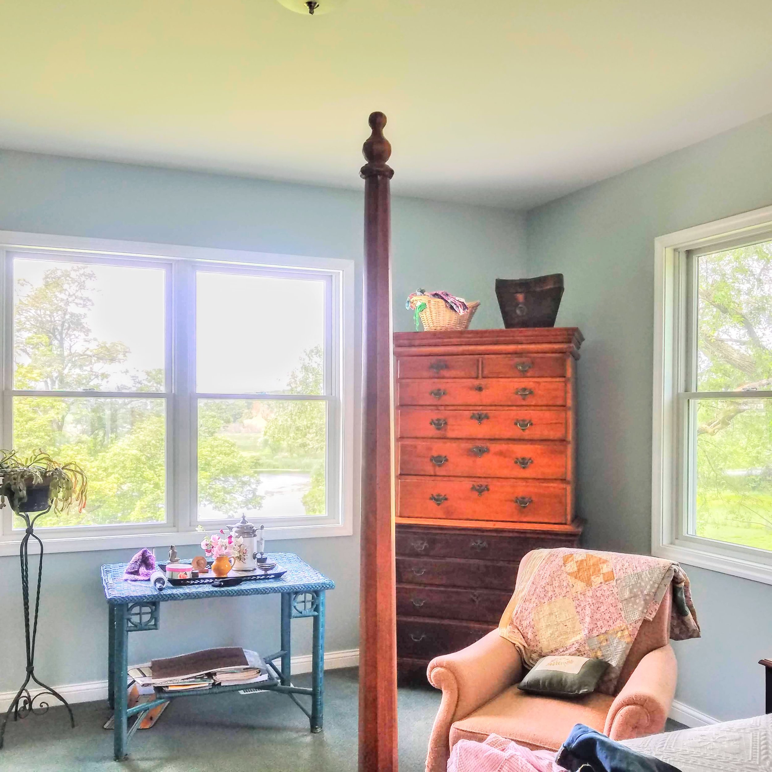
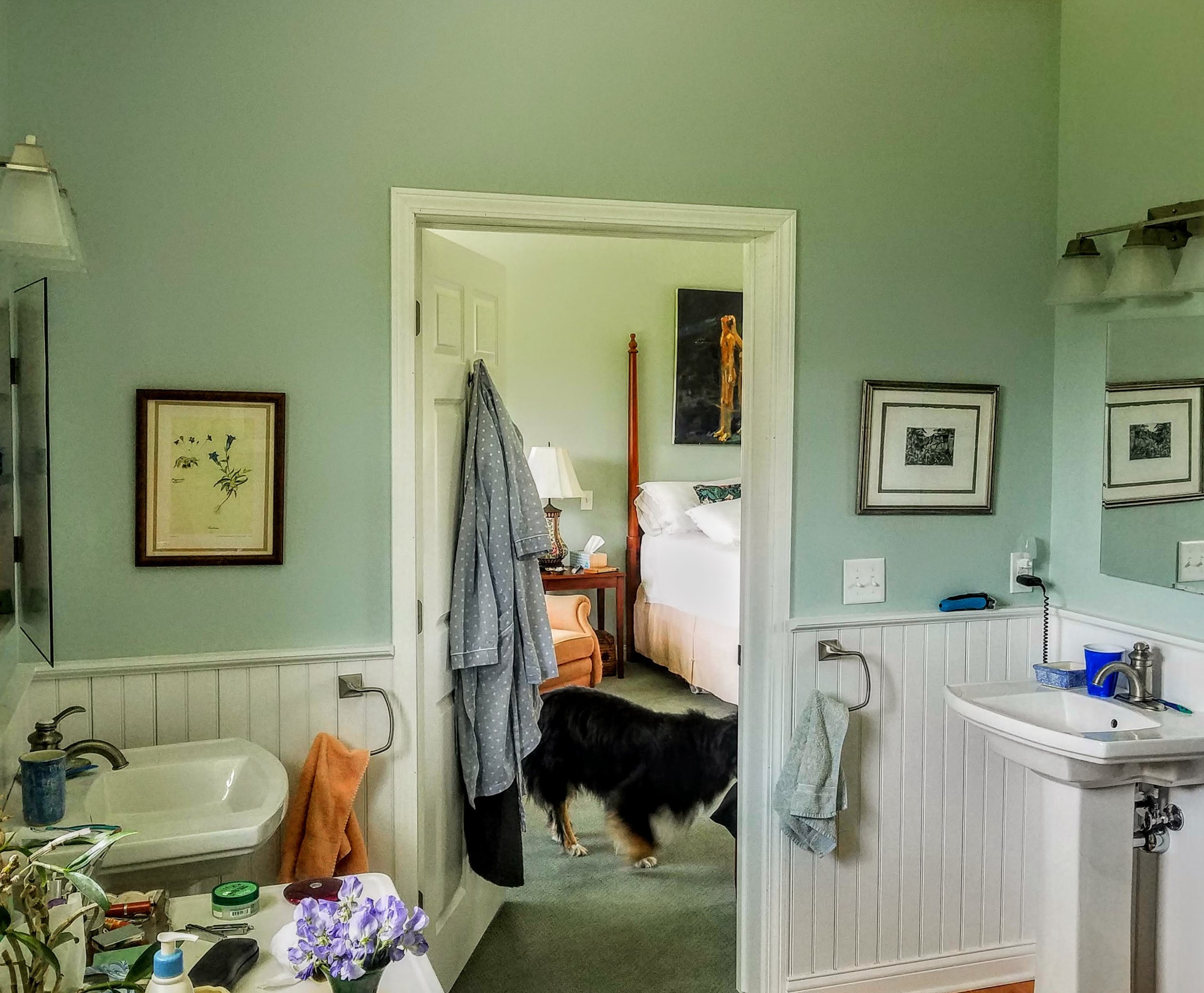
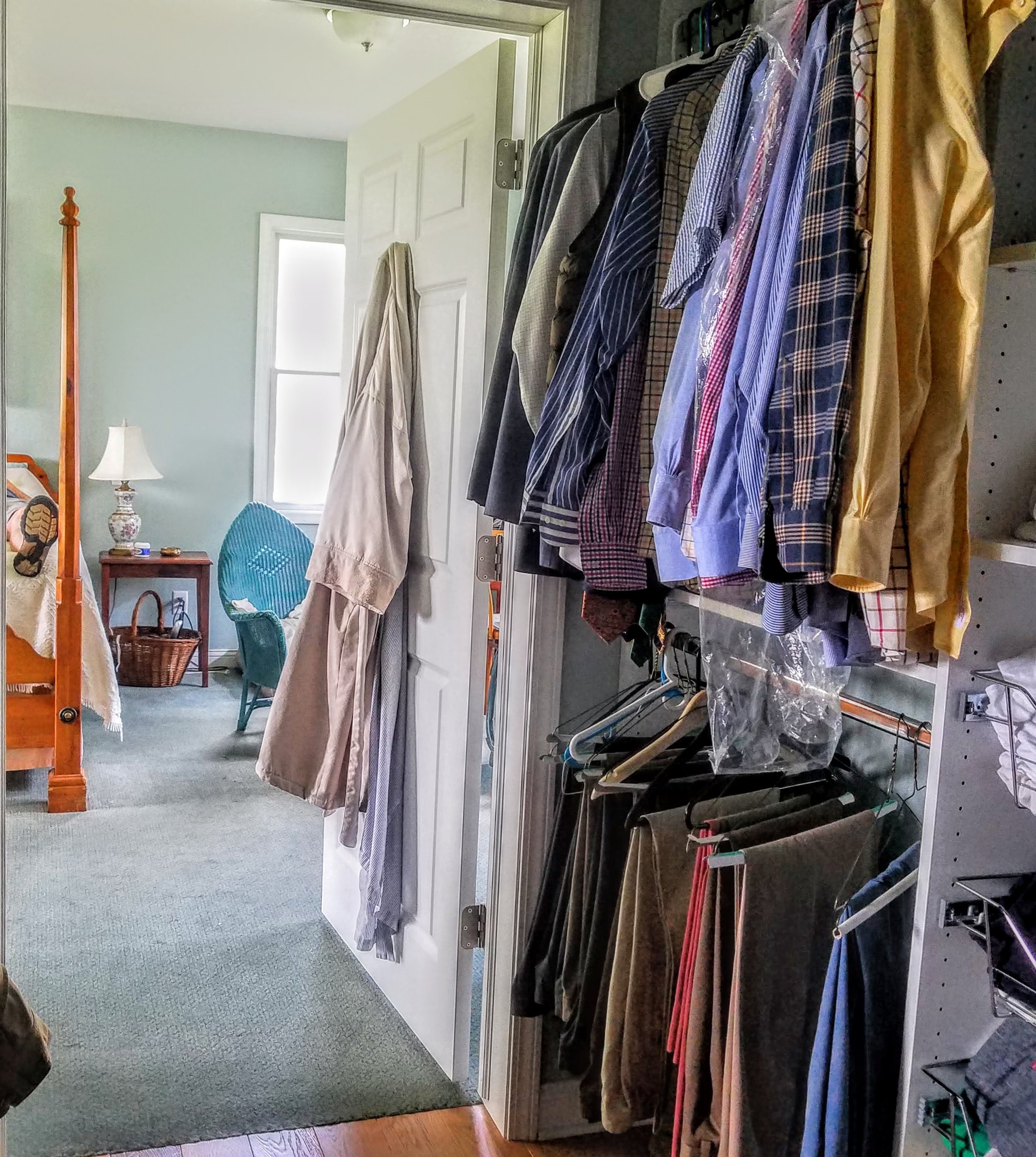
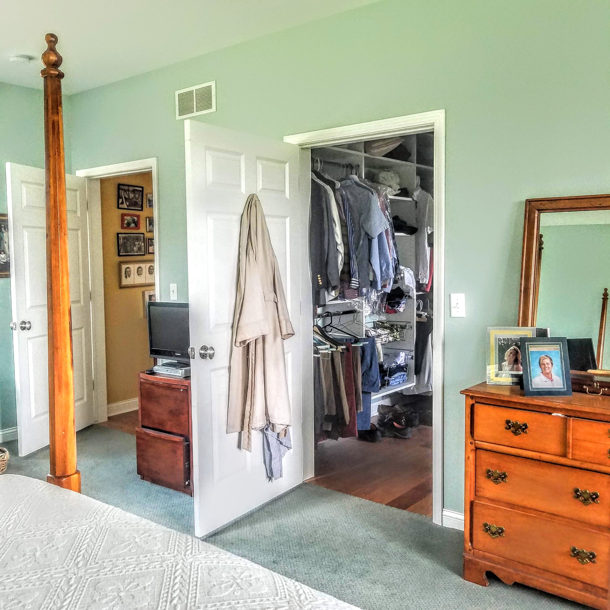
For the old folks the primary living space is all on one level. The bottom of the El holds the ‘couples’ realm’ a hall with a large linen closet with a door to the courtyard, a bedroom with windows all around to encompass views, a bathroom and a dressing room/closet. The bedroom has flow through out the suite. There is a door into the bathroom and a door into the dressing room and an opening between them.
For guests, we fitted out the basement with two guest rooms with large windows facing a terrace with views of the pond beyond, and a large bathroom with double sinks and a large door less shower. There is a door to the exterior for entering from the outside and access to the terrace.
R:What are the three most important things for the design of a house that make it easier to age in place?
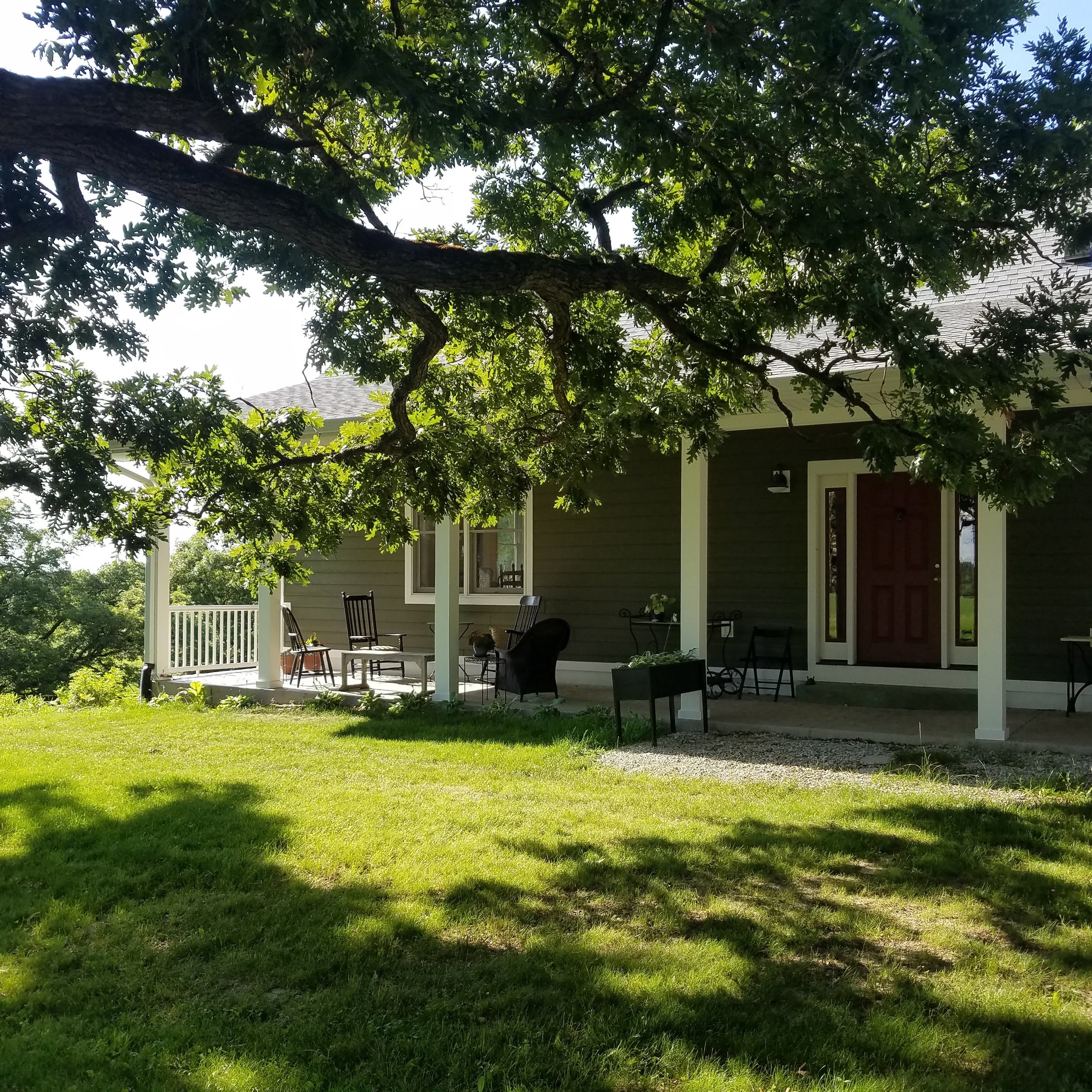
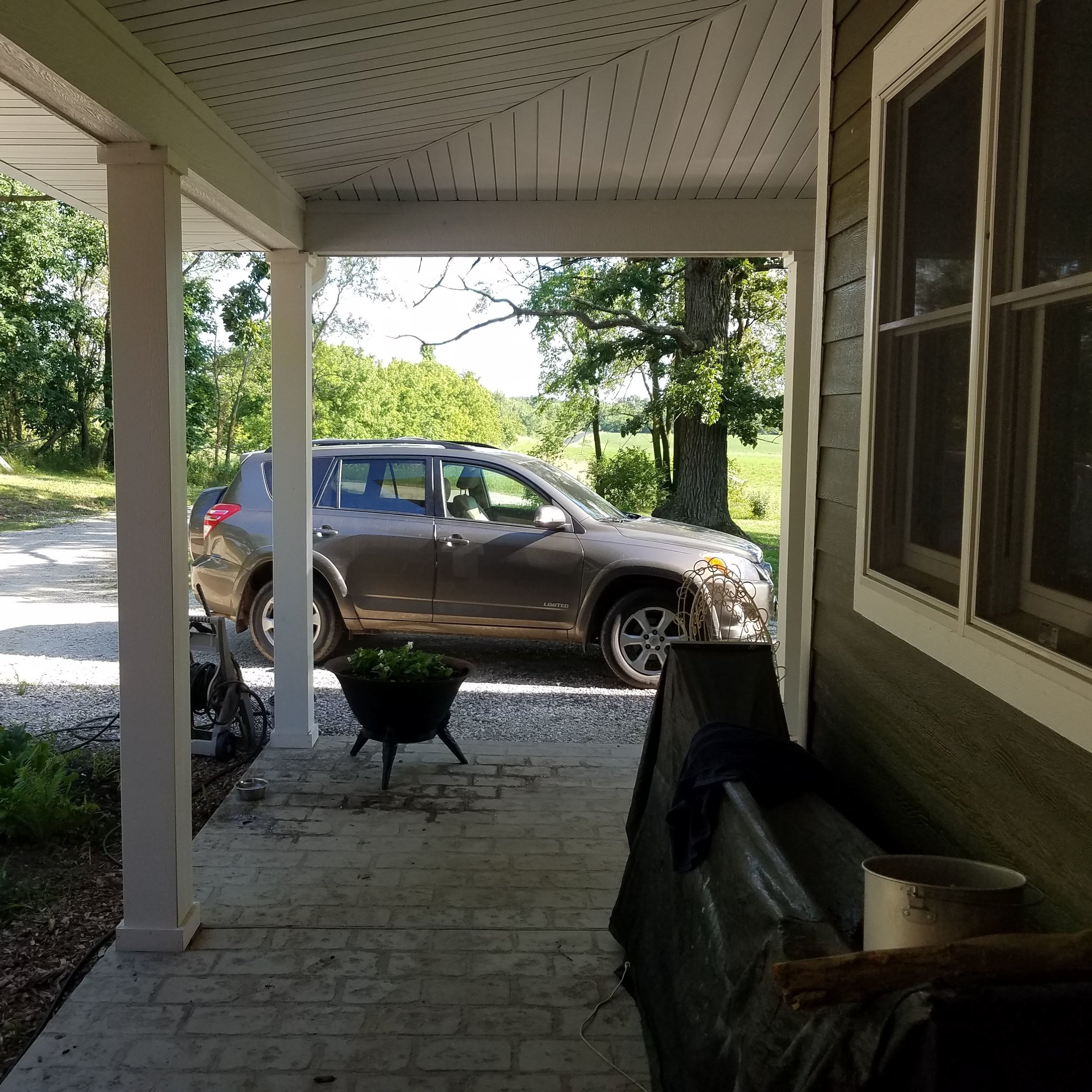
B:Well having everything on one level is important and minimizing stairs is obvious for accessibility. Then on the outside, accessibility to the front door especially during inclement weather; snow- we’re in Wisconsin. We put a big front porch with access to front door and then wrapping around to access the garage on the side. We also designed a parking slot right near the front door. So, accessibility is addressed in those ways.
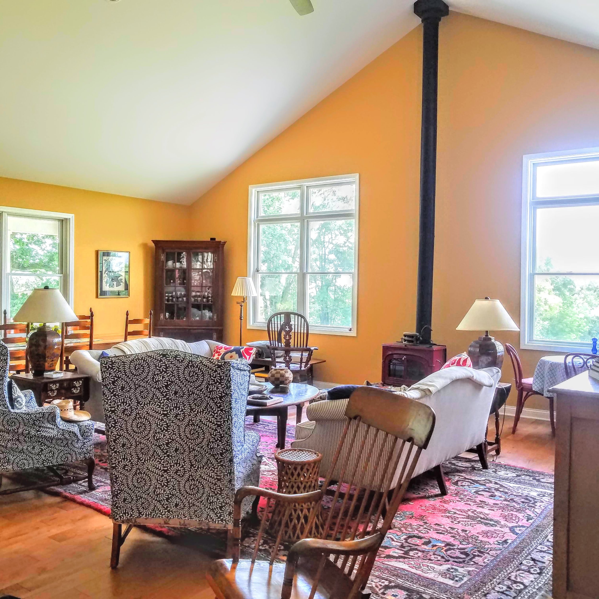
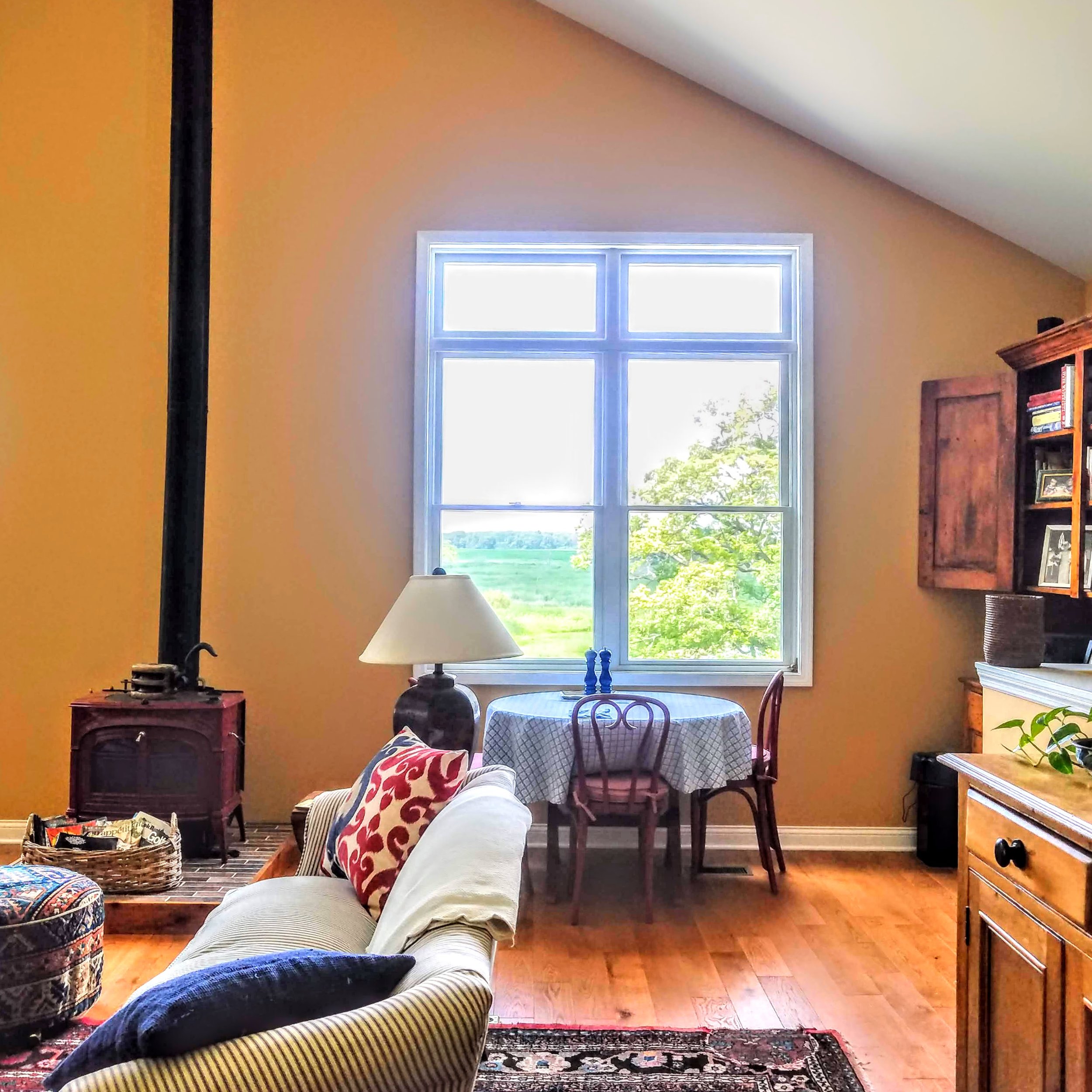
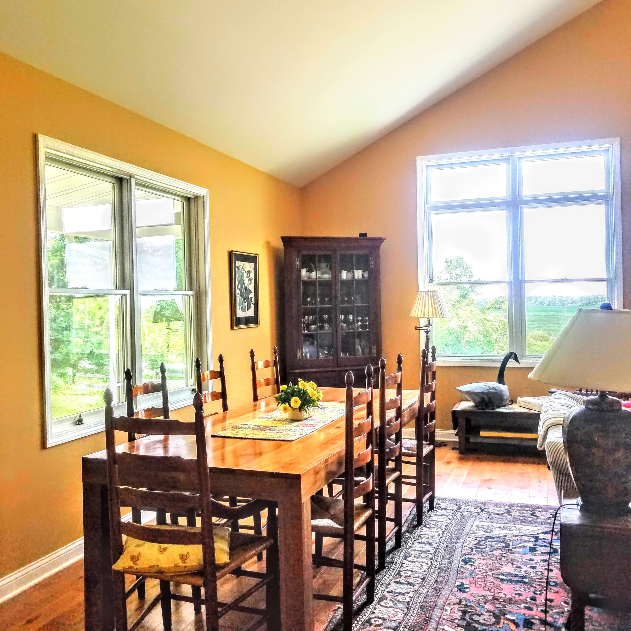
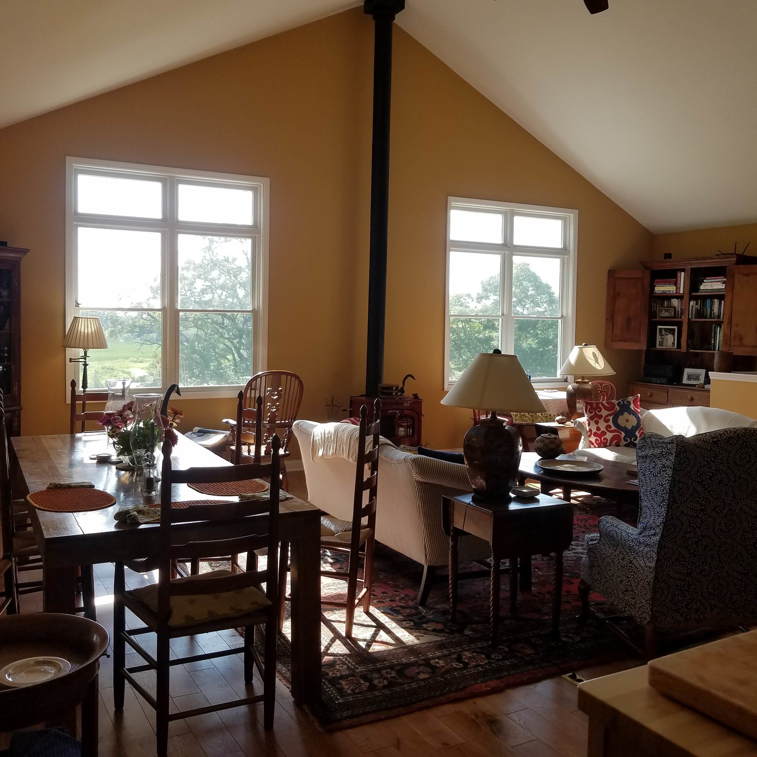
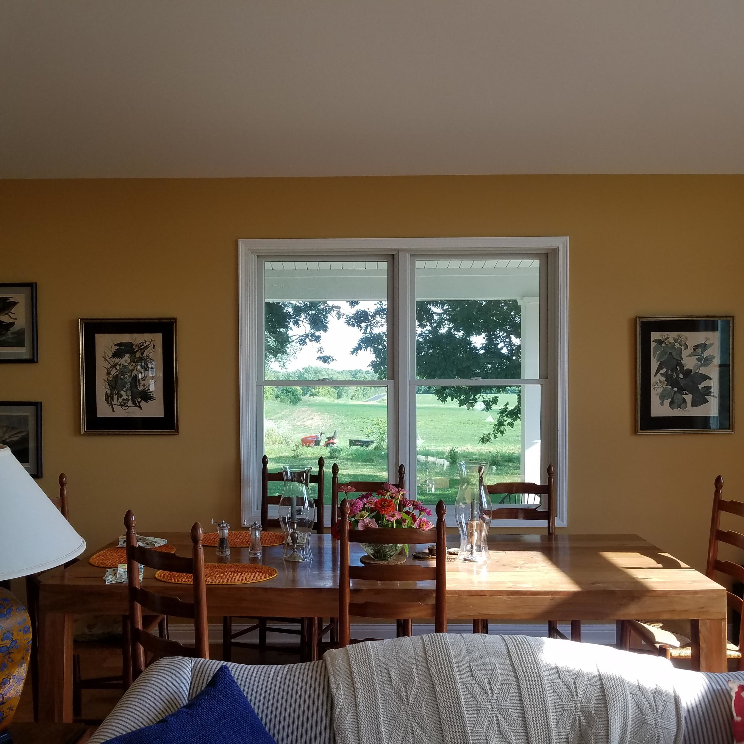
In the great room there are 6 ft wide double windows, there are double windows everywhere, and now with the innovations in windows, there is no downside to having lots of windows, even in the winter. In the wintertime, there is a tremendous amount natural daylight that still floods in this house even though the day is short and we’ve found out it really decreases the impact of fewer daylight hours in the wintertime, cause when it gets dark and you have no light coming in it gets pretty debilitating . We found out we haven’t had any problems acclimating from summer to winter. We also have no real need for window treatments. We have no neighbors except the riff-raff next door, and we want all the light we can get. Its so bright in this place we really don’t need lights till it gets dark.
Flow is also important as there is a feeling of spaciousness. There are varied heights in the ceilings, wide hallways and not a lot of clutter. Spaciousness make it more pleasant to live. That’s important as you age, to not have dark, rabbit-warren rooms and constrained corridors.
R:What is your favorite feature of the house so far?
I would say the access to the outside rooms, the porch to the south, the pond and terrace to the west, the courtyard and adjacent cottage and barns to the north. Those ‘rooms’ are as important to the house as the inside ones.
R:What is a feature most people don’t think about when designing a good retirement home?
B:Most people don’t have a feel for the flow of a house and most people don’t think about varied ceiling heights, that make a house interesting instead of boring. The ability to bring more light into the house has been impacted by the technology of the new insulated windows; before there were problems with cooling and heating. Also, the ceiling heights can be more easily changed because of the technology in building, for instance using micro-lams and engineered lumber and insulating; you can have large high ceilings with out impacting the heating and cooling. With the effective use of fans and having a wood stove, we can heat this place efficiently. From the middle of December to March we have a fire at about 6 pm. We can generate enough heat that we set the heat at 65 and the furnace doesn’t kick on until about 5 am.
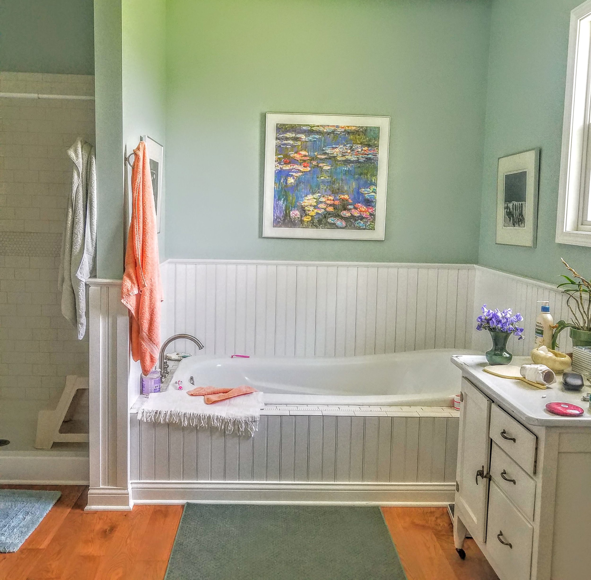
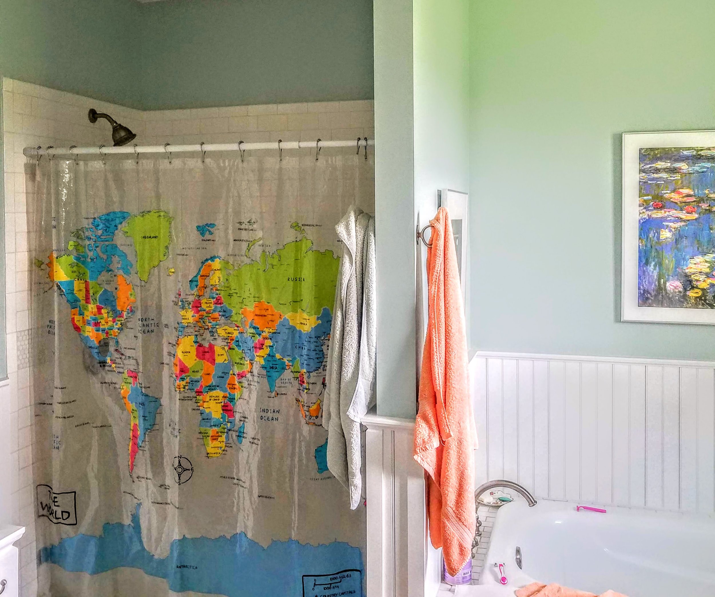
Also not constraining spaces. Wide halls. In retirement you need bathrooms spaciousness enough to hold 2 people. 2 sinks, showers big enough for 2 people and bathtubs big enough for 2 people. Flow is the largest contributor to the function of the home and the livability of the home.
R:What is one thing you wished you had done differently?
We should have put more insulation in the basement ceilings, not a heat problem but sound problem. Folks running around upstairs on the wood floors is noisy for guest rooms. Also, we didn’t have the French drains from the gutter downspouts put in at the time of construction.
R:In closing, Dad, has this been worth it? Designing this house?
B:It’s terrifying! the last thing you want to do at age 80 is build a new house! Especially when you are losing your eyesight!
R:Do you feel as your sight is diminishing, does the fact that you designed this house help with the vision loss and your ability to get around effectively?
B:Oh yeah, because the flow of the design and the accessibility issues has helped immensely.
R: Plus, you created it in your head, you have your own internal map.
B:Yes- that too, but you don’t create it, your wife creates it and tells you what to do. Like every piece of furniture was placed to scale in the plan. We designed the floor plan around the furniture we decided to bring to this new house. The kitchen was designed around all her kitchen stuff.
R:So, Mom what’s your favorite part of the new house?
S: What I love is, even in the wintertime, anywhere you go you have a constantly changing view of the vista. Nature provides you with a constantly changing scene. The other thing is this house feels good when there’s just 2 people and 1 dog. But then it is comfortable with 8 people also. You probably couldn’t build a house like this 100 years ago. The technology has made this possible, the number of windows. But even though there are a lot of windows they aren’t custom windows, so it’s more affordable. We just doubled up stock window sizes and grouped them for the same effect as big custom ones. I like the big spaces but then there are cozy spaces too like this East room and our bedroom. It has 2 sitting areas and I like that.
And so, our conversation ended and that’s the story. Two people who took on a huge undertaking to help themselves and their children create a place where they could perform their third act. I learned a lot in our conversation listening to them. Mostly, I learned the importance of light and how much of a difference it makes to older folks. Winter is long in Wisconsin and we do spend a lot of time indoors. For older folks this can be debilitating just in your daily outlook. I was surprised how much they appreciated the light and the changing outdoor scene and felt it made a difference to them and their mobility.
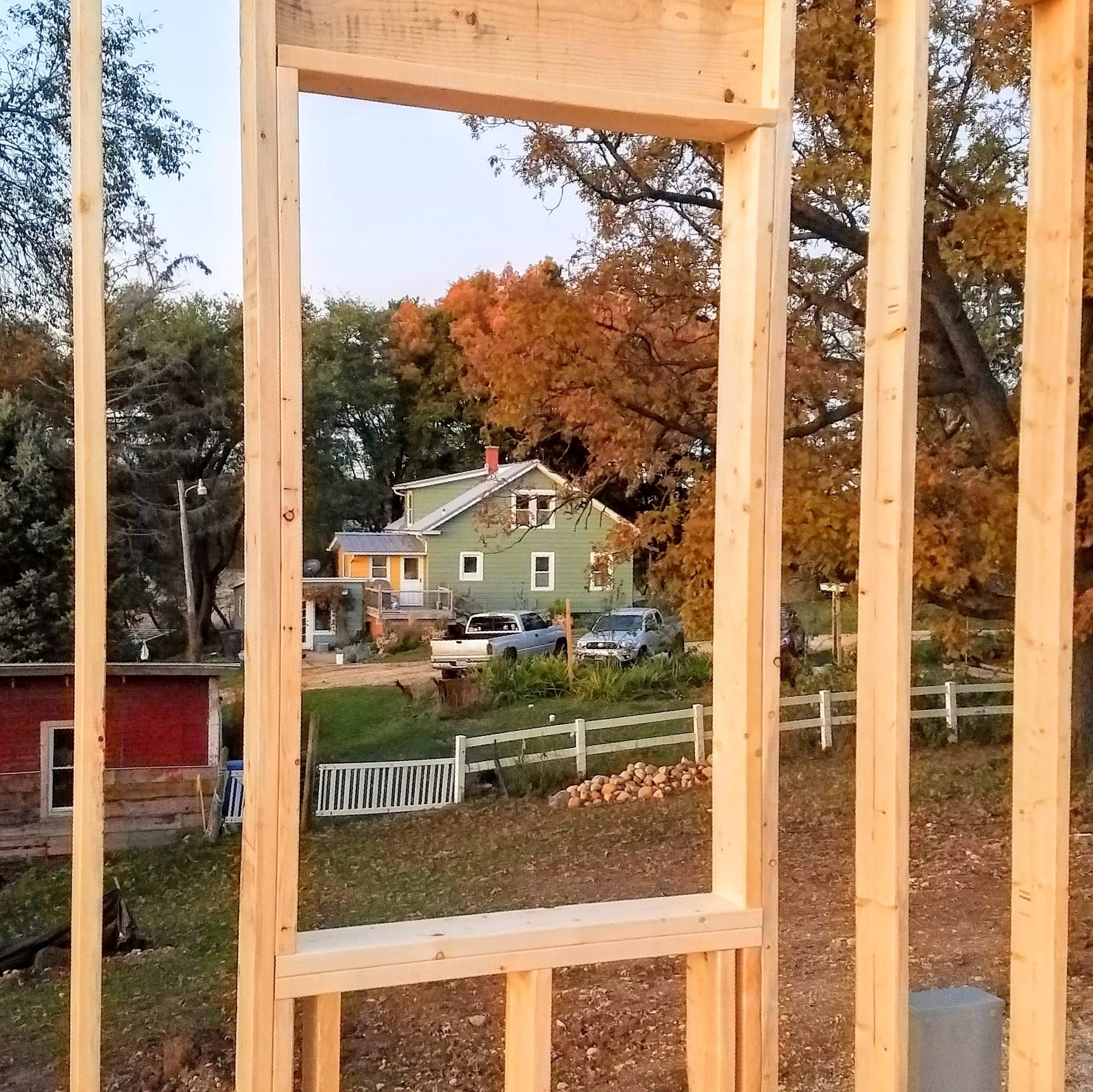
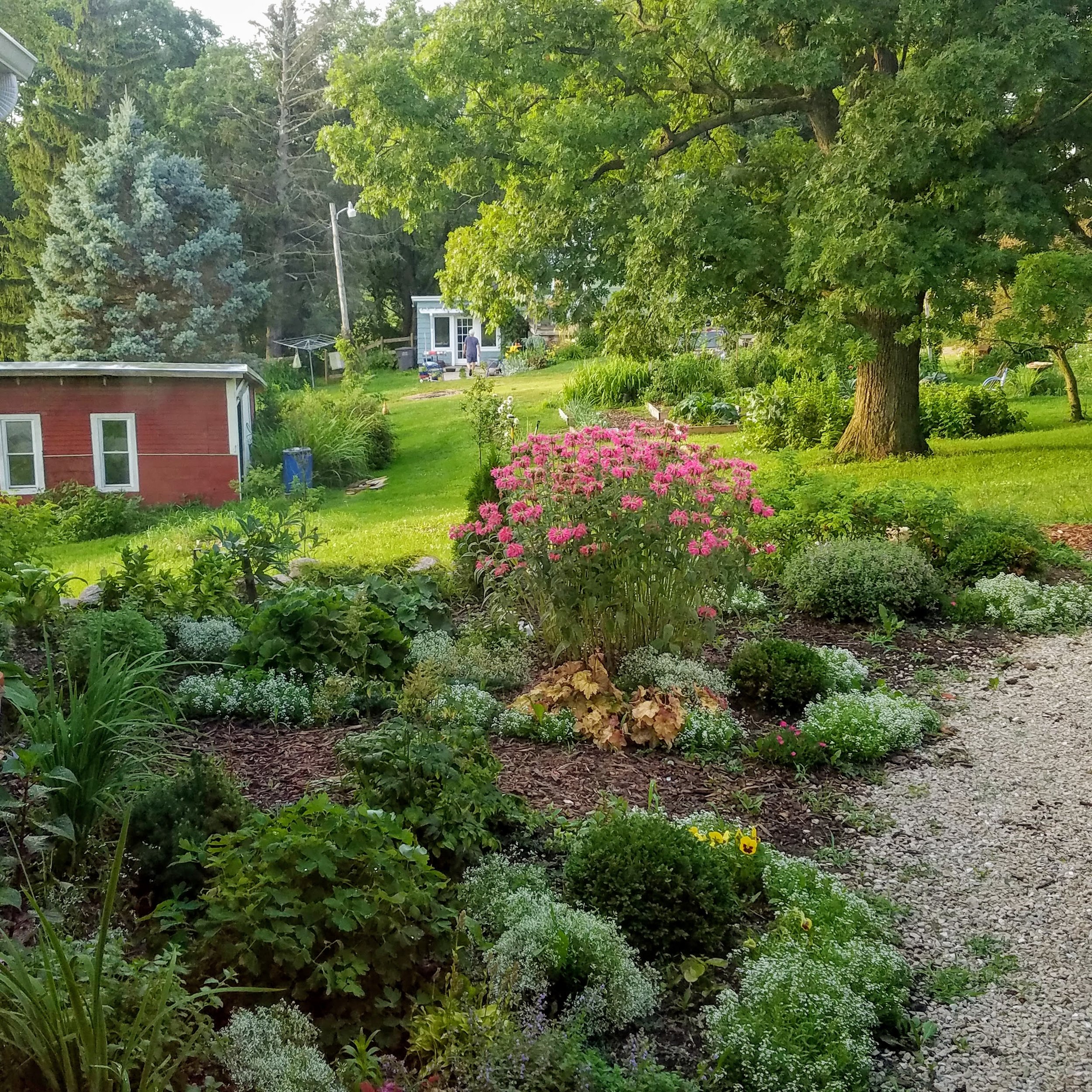
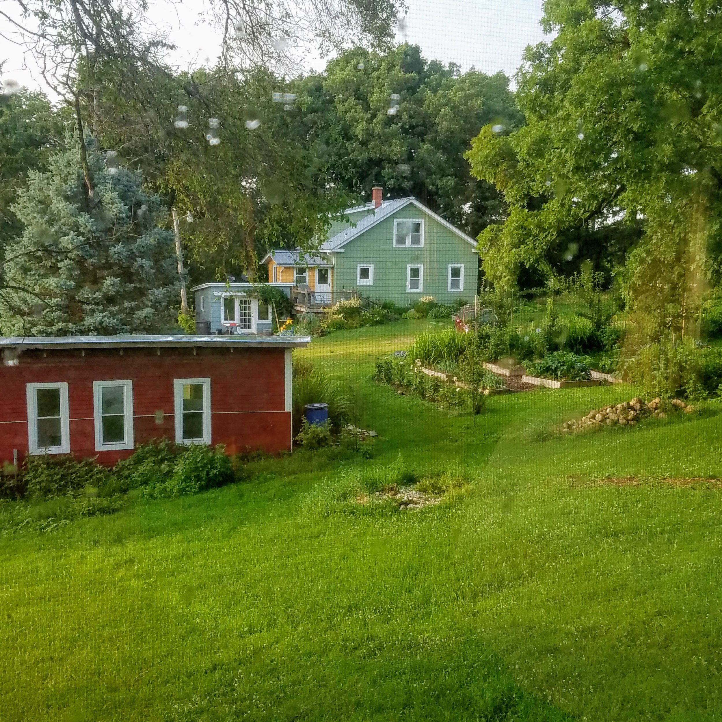
As their neighbor, I couldn’t be more pleased to look across the garden, past that giant oak tree and up into my mom’s kitchen courtyard and right into her kitchen window. I do admit I stand at my kitchen sink at night and check on them. I can see the lights of her kitchen shut off and the bedroom lights switch on and see their silhouettes move about. I am so grateful they are here, close. I love my new neighbors and the house they built.
If you are interested in learning about the Pattern Language here is a link to the website affiliated with the book: https://www.patternlanguage.com/ There are also other architects influenced by his work everywhere. One of these is the Architect Sarah Susanka writer of the Not So Big House series of books. http://www.susanka.com/
One of my favorite architecture firms is The Kubala Washatko Architects Inc from Cedarburg WI. They have designed some of my favorite buildings in the state, The Aldo Leopold Legacy Center, The Milwaukee Public Market, the Schlitz Audubon Nature Center and The Kohler Art Center and the Collectivo Coffee Shop in Bayview. Their website is fantastic and specifically this page which has great graphics and explains their take on the Pattern Language; http://www.tkwa.com/wholeness/
All these ideas can be incorporated in already established homes and are things to think about when dreaming and remodeling the spaces you live in, now and for the future.

